
Web Menus for the Modern Touch World

You’re on the road with your smartphone/tablet and pull up a website in your browser (not while you are driving, of course!). The fancy new restaurant in town lures you in with mouth-watering menus or that game score you so desperately want to follow on a sports site. While the beautifully designed website loads up fine, you realize that it is largely unusable with touch! Dropdown menus don’t pop out or clever interactions, that may work fine with a mouse pointer, fall flat on their face. You are not alone & plenty of us experience the same frustrations everyday. Let’s see how this looks like from a developer’s perspective.
The Problem
Coming from the desktop era where keyboard and mouse/trackpad were primary input devices, touch represents a whole new opportunity and a slew of challenges. The touch paradigm adds new interactivity options while complicating some traditional ones. To keep users happy, we web developers need to embrace touch, while maintaining existing interactions. Touch is everywhere these days - smartphones, tablets, laptops, hybrids, ultrabooks, TVs, kiosks, etc. - so we need to account for it.
Now, I realize we are opening a can of worms here – touch for web platforms has been thoroughly debated, researched and written about - make sure to check out some of the links in the "Resources" section for deeper understanding of touch interactions for web. However, in this article I cover some of the broader issues to keep in mind, some known workarounds and how the right UI controls can help.
Some Caveats & Solutions
The good news for web developers is that touch for web applications is nothing new and there is a lot support out of the box. iOS was one of the first popular mobile platforms to have dedicated touch APIs built for web browsers but nowadays touch support is ubiquitous in mobile browsers. Touch interactions are supported seamlessly in Chrome, Firefox, Safari, IE (which supports Pointer events) and other browsers. However, touch support does not take away the challenges of coding for touch interactions in web applications. Let’s look into some common pitfalls and solutions:
- Supporting touch natively does not mean dropping support for mouse/trackpad interactions. With devices such as Windows 8 Surface/hybrids/ultrabooks or Chromebooks, users may have both touch and mouse, and may even be using them simultaneously. Our web apps need to handle both and be adaptive. Also, touch support introduces new interaction paradigms – like multitouch or touch and hold; let’s use these to our advantage as it fits the user experience.
- Touch implementation on mobile web browsers often imitates mouse clicks, but there are some differences. A single tap usually raises the following events in succession:
TouchStart | TouchMove | TouchEnd | MouseOver | MouseMove | MouseDown | MouseUp | Click.
So, as you can see, if we do not take explicit action, mobile browsers will eventually trigger a mouse click in response to a finger tap – this is good. But where we easily get into trouble is when the touch interaction also triggers actions on one of the events raised prior to the mouse click. A common technique to get around this is to fire off the
preventDefault()JavaScript code inside the touch event handlers, so as to suppress the default mouse emulation. - Touch interaction with our big fat fingers is very different from the precision control offered by the mouse/trackpad. So, let’s keep this basic difference in mind as we design our web apps for touch. Touchability usually entails spacing between elements & enough padding so that the user can touch comfortably. There are plenty of usability studies & mobile friendly CSS (Cascading StyleSheets) themes to help us out in this department.
- I saved the best for the last – hover with touch. The mouse pointer metaphor separated the cursor position from an active selection, allowing developers to use hover states to hide/show information that might be pertinent to the user. However, most touch interfaces right now do not detect a finger 'hovering' over a target – this is a problem!
That pesky Hover
So, let’s talk about how we support hover in a touch world. A common pattern on the Web is to hide interactive content behind mouse hover. For example, a user can point to an element with a mouse and a menu is shown below it. Hover is typically enabled by using either the CSS :hover pseudo-class or the onMouseOver DOM (Document Object Model) event. Since, there is no exact physical metaphor to hover with a finger, we need to be a little careful in our usage. If our web UI has prolific usage of hover effect and that is the only interaction available to hide/show specific content, we will have a problem on touch devices.
Interestingly, all is not lost if we use hover; many touch implementations in mobile browsers may still trigger the hover effect. Usually, tapping a DOM element makes it toggle to CSS :active while the finger is down, and it also acquires the CSS :hover state. With IE, the CSS :hover is only in effect while the user’s finger is down; WebKit browsers keep the :hover in effect until the next tap or mouse move. So this is partially good news, except for the case where you want to keep hover separate from activation. A tap is essentially a hover and activation in one action; activation (like navigating to a link) trumps hover thus impacting the user experience.
One way around this hover effect is to switch to something more generic, like an onClick event to toggle content visibility. Another, possibly more robust alternative is to fall back to a new behavior from the W3C (World-Wide Web Consortium) ARIA (Accessible Rich Internet Applications Suite) suite. W3C Aria defines a way to make Web content and Web applications more accessible to people with disabilities. It especially helps with dynamic content and advanced user interface controls developed with Ajax, HTML, JavaScript, and related technologies. Modern web browsers will honor aria-haspopup property to simulate hover on DOM elements with hidden interactive content. Let’s write some code, which is based upon an IE10 sample from MSDN:
<style>
#hovermenu li ul {
 display: none;
}
#hovermenu li:hover ul{
 display: block;
}
</style>

<ul id="hovermenu">
   <li><a href="/news/" aria-haspopup="true">News Categories</a>
       <ul>
          <li><a href="/news/top">Top Stories</a></li>
          <li><a href="/news/technology">Technology</a></li>
          <li><a href="/news/sports">Sports</a></li>
       <ul>
   </li>
</ul>Telerik Controls to the Rescue
Creating adaptive web and mobile applications is difficult enough, before having to worry about low-level touch support for web menus. Thankfully, no matter which Telerik web control suite you pick up to use, menus work seamlessly between desktop world with standard mouse inputs and touch devices. Let’s dig in to see how.
Kendo UI
Kendo UI is an HTML and JavaScript toolset that includes over 70 UI widgets, in addition to robust framework support. In addition, Kendo UI Core, which includes over 40 popular UI widgets, is now free and open source! Kendo UI Professional includes a number of advanced UI widgets as well as server-side wrappers and quality support.
Now, let’s take a look at the Kendo UI Web Menu widget which is a simple dropdown menu control for navigation or organization, but on steroids. The Kendo UI Menu demos are available here and detailed documentation here.
Head to the Kendo UI Menu demo site on a machine with mouse/trackpad and then on a tablet/smartphone with just touch. Do you see that it works seamlessly across both? For mouse/trackpad, hover shows/hides content and for touch, the first tap triggers the hover state.
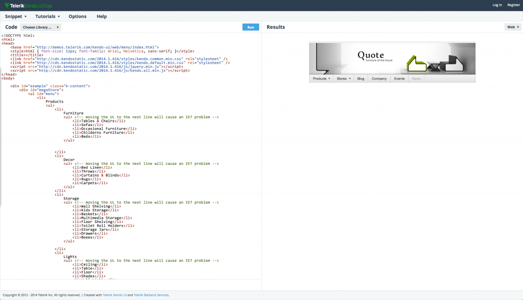
One of the nice things about the Kendo UI Demos is the support for built-in Dojos! Click on the “Edit this example” button and you will be taken to Telerik Kendo UI Dojos with the Kendo UI references pulled in via Telerik CDNs (Content Delivery Networks) and the code ready for you to slice and dice (screenshot below). Also, results of your code changes are readily visible in the Results pane, along with switchable skins to simulate web and mobile (iOS/Android/Windows Phone) platforms, as shown in the screenshot.

As you make subsequent code changes, the URL gets a unique GUID – so there's no need to host your code in order to try out on various devices; share the URL and run with it! If you want parity between the desktop and mobile functionality of your Kendo UI Menu, try this piece of code:
<ul id="menu">
    <li>Item 1
        <ul>
            <li>Sub Item 1</li>
            <li>Sub Item 2</li>
            <li>Sub Item 3</li>
        </ul>
    </li>
    <li>Item 2
        <ul>
            <li>Sub Item 1</li>
            <li>Sub Item 2</li>
            <li>Sub Item 3</li>
        </ul>
    </li>
</ul>

<script>
$("#menu").kendoMenu({
           openOnClick: true,
           closeOnClick: true
});
</script>openOnClick property of the Kendo UI Menu stops the pop-out on hover and triggers it only on click and the closeOnClick property specifies whether sub-menus should close after item selection. Now, the mouse interactions will behave just like touch. I'm not saying that’s the way to go, but just an option for you.
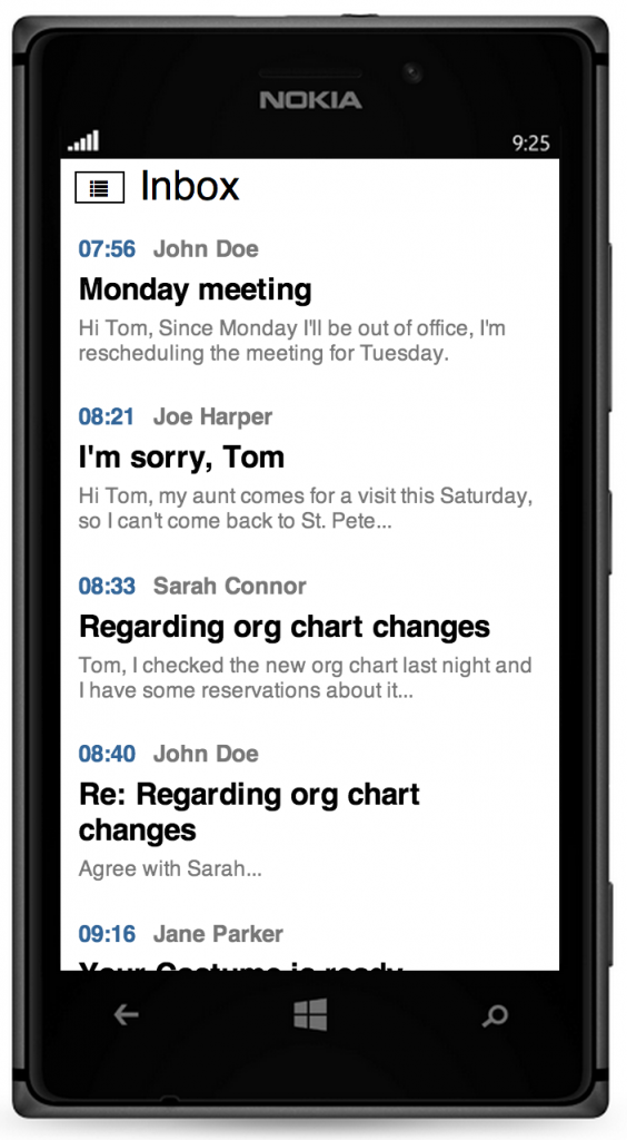
Of course, my assumption with the Kendo UI Menu is that you have a web app that you simply want to work everywhere without any more effort to restyle the menu for a mobile look and feel. If time and budget permits and you are looking for an even better mobile user experience, try the Kendo UI Mobile Drawer widget. The Mobile Drawer is a slide out menu that you are probably familiar with (screenshot below). You can check out the Kendo UI Drawer usage in the documentation.
UI for ASP.NET Ajax
If you’re building web apps in the ASP.NET world, take a look at Telerik’s UI for ASP.NET Ajax suite. It contains over 80 performance-tuned ASP.NET controls with mobile support and adaptive rendering. You can learn more about them and feel free to check out the free trial.
Now, the UI for ASP.NET Menu control is feature-rich and helps render a lightweight HTML5 menu structure for your navigation needs. You can learn more about the ASP.NET Menu or check out the demos.
With the Telerik UI for ASP.NET Menu, you can just leave it as is and it includes hover support on mouse/trackpad and click support on touch. Better still, if you want to make the mobile experience even more touch-friendly, use the built-in adaptive rendering behavior. Let’s write a little code:
<telerik:RadMenu ID="RadMenu1" runat="server" RenderMode="Mobile">
  <Items>
      ...
      ...
  </Items>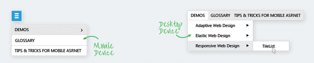
</telerik:RadMenu>RenderMode property of the Menu to Mobile. The menu immediately renders like the Kendo UI Mobile Drawer. To cover the rendering of both mobile and desktop devices, you could set the RenderMode property to Auto. This option does browser viewport detection and will automatically decide how to render the menu on a smartphone, tablet or PC, as shown in screenshot. For more accurate device detection, you could reference the Device Detection Framework, which ensures that the control is rendered every time with appropriate UI according to the device screen size.
Conclusion
The web should simply work whether you are browsing with a mouse/trackpad or on touch devices, with a little forethought from the developer. No longer should we be frustrated with foiled interactions and hover failure on web menus with touch devices. Little tweaks go a long way towards the perfect mobile user experience. If you choose to use Telerik UI controls, be it Kendo UI for the HTML5/JavaScript world or UI for ASP.NET Ajax, your menus always work, adapting to the user’s device. Let’s make a beautiful, touchable web!
Resources for further reading

Sam Basu
Sam Basu is a technologist, author, speaker, Microsoft MVP, gadget-lover and Progress Developer Advocate for Telerik products. With a long developer background, he now spends much of his time advocating modern web/mobile/cloud development platforms on Microsoft/Telerik technology stacks. His spare times call for travel, fast cars, cricket and culinary adventures with the family. You can find him on the internet.
Related Posts
Comments
All articles
Topics
Latest Stories
in Your Inbox
Subscribe to be the first to get our expert-written articles and tutorials for developers!
All fields are required