
The DNA of Responsive Web Design

The following is an excerpt from the new whitepaper The Anatomy of Responsive ASP.NET Apps
For the past five years, responsive web design has gone from being called a trend to being synonymous with mobile web best practices. If you're a web developer, then responsive design will probably be a requirement on a project in the near future, or maybe you have already jumped in on a project using a popular framework and would like to learn more. So let's take a step back and review the basics to get a deeper understanding of how the technology works by deconstructing the basic building blocks.
Responsive Building Blocks
Responsive design is defined as fluid grids, flexible content and media queries. In general responsive web design (RWD) means that the layout of the project needs to adapt to the browsers viewport size. The content of the application should make efficient use of the available space on the screen, generally by being able to shrink or grow with varying container size. Let’s take a look at what techniques can be used to achieve RWD.
Media Queries, the Cornerstone of RWD
Media queries are a feature of CSS3 and without it responsive design would not be possible. A media query allows us to write expressions capable of detecting media related features.
Media queries can contain a media type and/or media feature expressions. When all parts of the media query return true, the styles within the media query block will be applied to the stylesheet. A media query is similar to the if statement of most major programming languages, except that it is designed specifically for media detection.
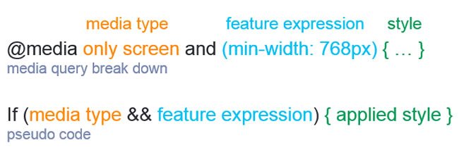
Let's look an example and break down the various parts of a media query.
/* For screens > 768px */

/*  If the device has a screen
    And the device width is greater than or equal to 768px
    then color property = red */

@media only screen and (min-width: 768px) {
    .on-large { color: red; }
}
There are a few techniques for using media queries to transform layouts. These techniques are generally referred to as mobile first or desktop first RWD. In either scenario, a base layout is created and then device-specific CSS styles are conditionally added to append or override the existing style.
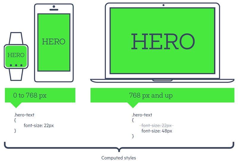
Let's look at an example of mobile first responsive design. In this example we'll define a base font size and then increase the font size for large screens.
/* Base style for small devices small and up */

.hero-text { font-size: 22px; }

/* For large and up */
@media only screen and (min-width: 768px) {
    .hero-text { font-size: 48px; }
}
It's important to understand how media queries work because they are essential to developing responsive apps and websites. Popular frameworks like Bootstrap, Foundation and Telerik's RadPageLayout make extensive use of media queries to create their powerful grid systems.
While each grid system does vary slightly from one framework to another there are many common components and techniques used among them. Let's peer at the source code of a few popular frameworks to understand how they work.
Grids, rows, columns and breakpoints
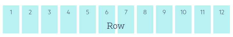
Fluid grid systems are the tool of choice for creating responsive layouts. Grids consist of multiple components working together to compose an infinite number of designs. For the most part, grids are made up of rows which are divided into columns. The columns are not physical columns, but instead a unit of measure for an element's width. Rows are typically divided in to 12 columns because it is a number that is easily divided equally into whole parts. Columns also abstract away the math for dividing up the layout into percentages.
Column classes abstract away lengthy percentage values like
.col-xs-5 { width: 41.66666667%; }
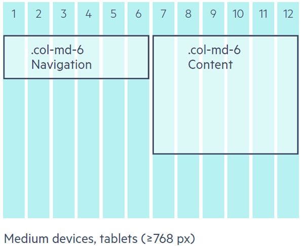
Grid systems support multiple layouts by specifying the device's size and width as part of a column. The syntax may vary between frameworks but the general concept is the same. Each device size has a corresponding media query and style properties that create the desired layout effect. These media queries are referred to as break points. Bootstrap identifies its break points as xs (extra small), sm (small), med (md), lg (large).
<!-- Bootstrap syntax col-[device size: xs, sm, md, lg]-[width: 1-12] -->
<div class="col-sm-12"> ... </div>
By combining multiple column declarations the layouts can take on different widths or stack vertically when an element occupies all 12 columns.
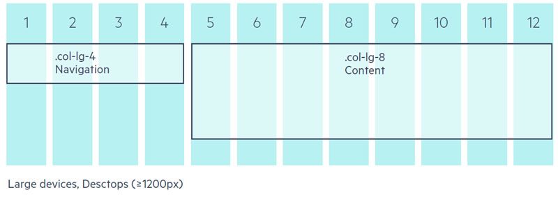
<div class="col-sm-12 col-md-6 col-lg-4">
    <!-- some navigation -->
</div>
<div class="col-sm-12 col-md-6 col-lg-8">
    <!-- some content -->
</div>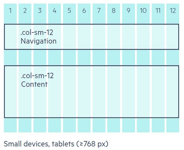
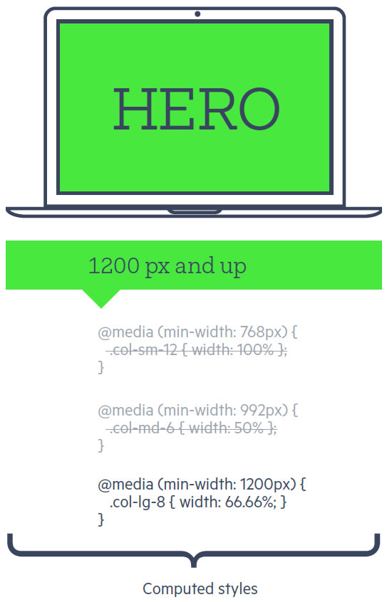
CSS media queries make this possible, just as we saw with the mobile first example. Since the size specific styles are contained within a media query, they are only applied by the browser when the media query expression is satisfied. Additionally, because of the CSS source order, the styles defined later in the style sheet will take priority over those above.
/* bootstrap source code */
@media (min-width: 768px) {
    .col-sm-12 { width: 100% }
}

@media (min-width: 992px) {
    .col-md-6 { width: 50% };
}

@media (min-width: 1200px) {
    .col-lg-8 { width: 66.66666666666666%; }
}
Some grids have the concept of a container. The container element is the outer most element of the layout and its purpose is to create white space between the layout and the edge of the browser window.
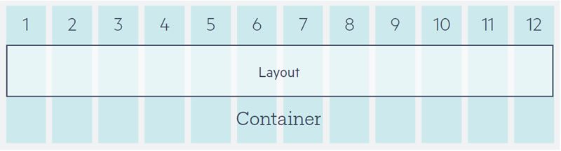
If you notice your content is directly touching the edge of the browser or device's display, make sure you didn't forget to include a container element.
<div class="container">
    <!-- begin rows here -->
</div>
Let's dig in to Bootstrap's source code and see how it works.
.container {
  padding-right: 15px;
  padding-left: 15px;
  margin-right: auto;
  margin-left: auto;
}
@media (min-width: 768px) {
  .container {
    width: 750px;
  }
}
@media (min-width: 992px) {
  .container {
    width: 970px;
  }
}
@media (min-width: 1200px) {
  .container {
    width: 1170px;
  }
}
As you can see, a base padding of 15px is set for all browsers. As larger screens are detected, the container element's width is increased, making the layout expand to accommodate the available space. If more or less white space is desired around your layout then the width values can be changed to fit your design needs.
Working With Content
A responsive app or site is only as flexible as its content. When building responsive, it is important to make sure images, video and other media render to make efficient use of the available space on the screen. Additionally, the content should be easily readable with appropriate font and image sizes.
A common problem that occurs is when a small screen device accesses a website is that images don’t fit appropriately. Images may be too large for the layout extending past the viewport or may over lap other elements.
The Foundation framework addresses the problem by setting the max-width of all images to 100%. By using the max-width property, this ensures that an image occupies 100% of its containers width but never exceeds its natural width.
When using
max-width, if an image's natural width is 500px, it will only grow to 500px wide. However, when the CSSwidthproperty is used instead, the image will grow indefinitely to fill the parent container.
/* Foundation Source Code */
img {
    height: auto;
    max-width: 100%;
}
Bootstrap employs a similar technique using the class .img-responsive which must be applied individually to images that need this functionality.
<img class="img-responsive".../>More often than not, images will need to be flexible, so, in my opinion, it is easier to set the value for all images, as Foundation does, and then add a class to disable the functionality when needed.
/* disable flexible images */
img.no-resize { max-width: none; }
Content really is king, and it can make or break a layout. Media elements like embed, video, iframe and object need a little help to guarantee they behave correctly on all screen sizes. Responsive frameworks have special classes just for these items.
Classes like Boostrap's.embed-responsive-item and Foundation's .flex-video guide browsers making sure embedded media dimensions are based on the width of their containing block by creating an intrinsic ratio that will properly scale on any device.
<!-- Bootstrap -->
<!-- 16:9 aspect ratio -->
<div class="embed-responsive embed-responsive-16by9">
  <iframe class="embed-responsive-item" src="..."></iframe>
</div>

<!-- 4:3 aspect ratio -->
<div class="embed-responsive embed-responsive-4by3">
  <iframe class="embed-responsive-item" src="..."></iframe>
</div>

<!-- Foundation -->
<!-- 16:9 aspect ratio -->
<div class="flex-video widescreen">
    <iframe src=..."></iframe>
</div>

<!-- 4:3 aspect ratio -->
<div class="flex-video">
    <iframe src=..."></iframe>
</div>
Single pieces of content like images and video are easily made responsive thanks to these helpful classes. Complex items like carousels, galleries, charts, graphs and more require responsive user interfaces.
Responsive UI
RWD frameworks are a great starting point and include UI components to get your project started. The components usually contain the basic features needed to operate and work well for building prototypes.
Feature complete applications require robust UI features, and it is important to choose a UI suite that supports responsiveness out-of-the-box. Telerik's Kendo UI, UI for ASP.NET MVC and UI for ASP.NET AJAX have responsive charts and controls that work seamlessly with any RWD framework you're using.
Conclusion
RWD is no longer a buzzword or trend, it's a design pattern that is a necessity for modern web applications. Using fluid grids, flexible content and media queries, apps can be created for any screen size. CSS media queries are a simple but powerful feature that makes responsive design possible. By learning how media queries are used in popular frameworks, projects can be built using common patterns and practices for responsive web design.
Be sure to check out our free whitepaper that will walk you through the must-know responsive web practices to help you succeed in building apps for any screen size.
Header image courtesy of Micah Baldwin

Ed Charbeneau
Ed
Comments
All articles
Topics

Latest Stories
in Your Inbox
Subscribe to be the first to get our expert-written articles and tutorials for developers!
All fields are required