
Create a Modern UI with UI for WPF

It's 2015 and with the release of Windows 8.1 and upcoming release of Windows 10, touch is becoming the norm for PC users. PC manufactures are releasing touch-screens for everything, including laptops. This doesn't mean that you have to abandon your skill set and write Windows Store Apps to utilize this functionality. With Telerik UI for WPF, you can make any app touch-friendly with just a couple of lines of code.
In this article, I'll talk about a control included in Telerik UI for WPF called RadTileList. Simply put, if you want to achieve the Modern UI Style for your XAML applications, similar to the modern mode of Windows 8.1, then RadTileList has you covered. It displays tiles in a mosaic manner and allows the end-user the ability to smoothly scroll left or right with a gesture, or they can be reordered by using drag and drop just like in Windows 8.1 and 10. You can use RadTileList with a touch screen monitor as well as a mouse without forcing your users to upgrade to a new OS.
Note: For more in-depth information on how to make your app touch-friendly, then check out my session at TelerikNext. More details are included at the end of this article.
Getting Started
Make sure you have downloaded and installed UI for WPF before proceeding. Once that is complete, open Visual Studio and navigate to the Telerik template and select Windows -> Telerik C# WPF Application. Provide a name and place a checkmark in Telerik.Windows.Controls.Data and it will automatically select the other dependent references. Finally, press Next then Finish and our WPF app is ready to begin coding.
We'll begin by adding a Background color to our WPF app and creating three tiles that resemble the experience you might have in Windows 8.1. We will just use a color for now.
This will generate the following (I'm using a touch-screen):
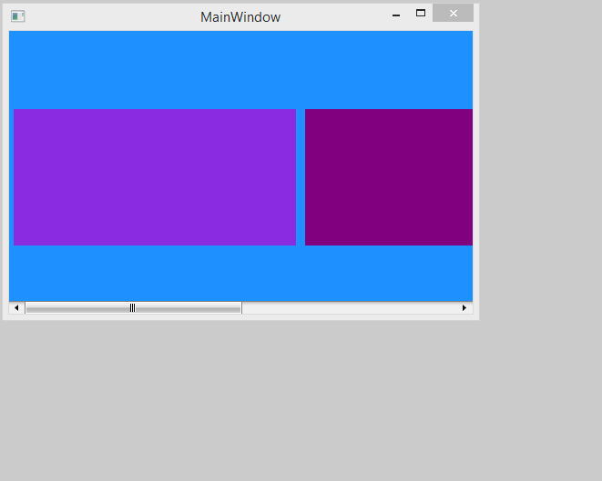
Note: That without adding any additional code, we were able to handle right and left swipe events and select an item. It also automatically re-sized the Tiles as the Window expanded.
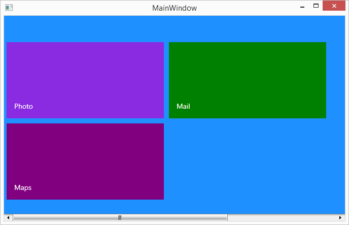
Adding Meaningful Text
Now that we have the look and feel of a Modern App, let's add some meaningful text to our Tiles. We will begin by adding a TextBlock Style to our Grid.Resources that matches the look and feel of Windows 8.1 and then we will apply the style to our Tiles. Your Grid should look like the following now:
Adding UI Elements to the Tiles
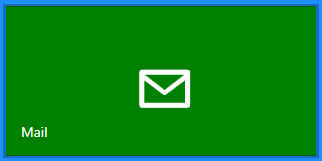
We could easily use Path Data if we wanted to for our "Mail" tile with the following code :
Which would produce the following Tile:
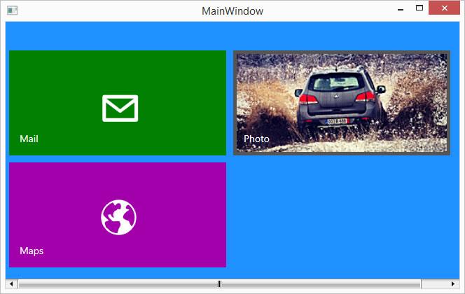
We'll do the same thing for Map since Path data is easy to use and requires no additional assets added to our project.
But you're probably wondering where you would find the Path Data to input in that field. One great resource for path data that you may use freely in your enterprise apps comes from XAMLALOT. In this case, you can search the database for existing clipart such as the Mail icon, and select “Download XAML Canvas as Text”. You will want to remove everything inside the code snippet except for the Path data as the code snippet is formatted to be used in with a canvas. Another free option is called, Open Clip Art. Search for the clipart that you want, and then convert it from SVG format to XAML using Inkscape. If you prefer to create your own path data, then there are a number of ways to do so. I prefer Microsoft Expression Design 4 and use the "Copy XAML" option that is available. There are other tools that do the trick, so search and find what is best for you.
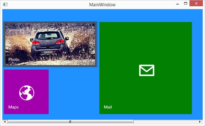
For more complicated backgrounds, you would probably use an image. Here, we have added a photo.png to our project.

Our app currently looks like the following :
Different Sizes of Tiles
It is worth mentioning now that there are three different Tile Types found in Windows 8.1.
- Single Tile Template – Otherwise known as the Standard Tile Template.
- Double Tile Template – Otherwise known as the Wide Tile Template.
- Quadruple – Two Wide Tile Templates stacked on top of one another.
A simple example of this would be setting the TileType as shown below :
Since the Maps Tile is something that our user may not use as often, let's change that tile type to a "Single" tile and the "Mail" tile to a Quadruple.
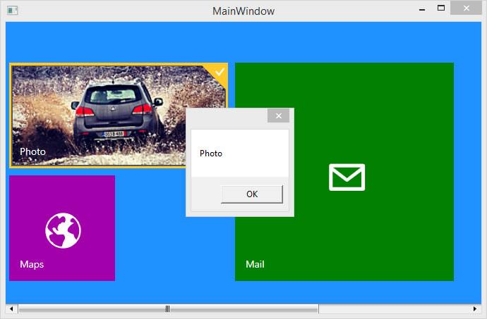
Determining Which Item was Clicked
We can easily determine which tile added was clicked by adding a SelectionChanged event to the declaration of RadTileList and writing a couple of lines of code as shown below.
The declaration in XAML:
The code in ourMainPage.xaml.cs:
As long as a x:Name is set on each tile, then the MessageBox will display the TileName as shown below.
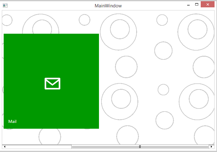
What Can We Do Better?
In most Modern Apps, they usually have some sort of background with the tiles layered on top of it. We can achieve that by removing the background color and adding the following code after we have declared the RadTileList in XAML :
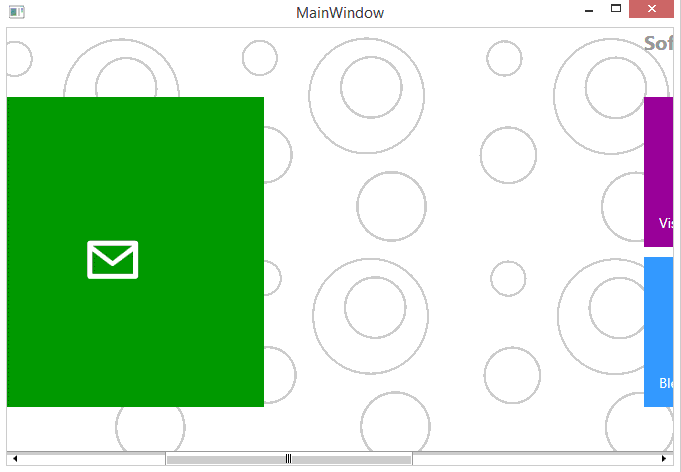
Grouping Items
The app is starting to take shape, but another feature of modern apps is grouping. RadTileList can arrange tiles into separate sections depending on each user's requirements. Those groups can be modified through its GroupTemplate property.
First, we need to add the DataTemplate to our Grid.Resources as shown below:
Then add the GroupTemplate property in the XAML Declaration. Finally, we'll use the built-in TileGroup to give each group aHeader and an Index in which it will appear.
Let's check this out in action.
The source code for this article is available on my GitHub repo.
But Wait, there is MORE love for WPF happening at TelerikNext!
We took a look today at making a WPF app modern by using the TileList UI control. We have seen that it allows us to have a Modern UI similar to Windows 8.1 in our WPF applications. While many enterprises are investigating when or if they are going to upgrade to Windows 8.1 or 10, you can go ahead and provide your users a modern UI now.
But here is the punch line - we've barely scratched the surface of modern apps with UI with WPF!
We have a conference coming up called, "TelerikNext" and I have a session called, "Building Touch Apps with UI for WPF", that I'd love for you to attend. If you use the promo code CRUMP when you register, then you will receive $50 off the standard ticket price.
We'll talk about the release of Windows 8.1 and 10 and how touch is an important consideration in any app going forward. We will take a standard WPF app and turn it into an application that responds to various gestures including: swipes, pinch, tap, tap and move and tap and hold. We will also explore various touch-friendly controls and explore scenarios of when you should or shouldn't use this feature.
As a teaser, your app will go from this...
...to a touch-friendly version with just a couple of lines of code. Notice how the buttons and fonts are larger and designed to work with touch.

See you there!
Header image courtesy of Intel Free Press

Michael Crump
Michael Crump is a Microsoft MVP, Pluralsight and MSDN author as well as an international speaker. He works at Telerik with a focus on everything mobile. You can follow him on Twitter at @mbcrump or keep up with his various blogs by visiting his Telerik Blog or his Personal Blog.