
4 Mistakes To Avoid in Mobile App Development

I've been an mobile app developer since I got my first iPhone four years ago, concentrating mostly on educational and fitness apps. Some of the apps I've built over the years include a Seven Minute Workout app, a stretching app, apps to teach Chinese conversation and Middle-Eastern dance, e-books, apps to help kids practice their musical instruments, and others. I enjoy releasing these little software nuggets into the wild to solve a small problem or ease a pain point for a customer. Most of my apps are paid apps between $.99-$2.99 done as moonlighting side projects, and thus, without large resources for marketing and social media pushes, they have, in general, earned modest download rates.
So, imagine my surprise when one of my apps, Roomalyzr, hit the app store and garnered over 400 downloads its first day, and consistently 100-150 downloads per day subsequently. Caught by surprise, I soon realized that I had made some mistakes in the design of this app that, while successful, could have been more so had I known more about the design requirements for this type of app.
In this article, I am going to share the sometimes difficult lessons I learned from releasing the Roomalyzr app, and outline some tips on what not to do when designing an app. Avoiding these mistakes might get you a lot of downloads and, if your app is done right, some recurring revenue.
1. Don't Be Your Own Beta Tester
The Roomalyzr was born as an entry in a contest hosted by Corona Labs, makers of Corona SDK which had introduced Graphics 2.0 with new ways of working with graphics filters and special effects. In my mind, it was the perfect test bed for a room-painting, graphic design app.
Over a weekend, the Roomalyzr was born, built, and sent to CoronaLabs and was lucky enough to win in its category of business apps. On a roll, I decided to launch the app for iOS and Android, and followed my own advice on pre-launch marketing tasks, creating a Twitter account, websites (I secured both roomalyzr.com and RoomPaintingApp.com), a nice icon, beautiful screenshots, publicity, and an app trailer video.
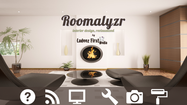
The current Roomalyzr's interface
I also submitted the app to PreApps to get a little pre-launch visibility...and here's where I made my first mistake!
I didn't feel that I had time to follow through with the volunteers who signed up to beta-test the app, and instead did my own device testing. Beta testing is a simple task that should be part of every app deployment - asking friends, family, kids, or volunteer testers to just click through and make sure they understand how the app works. Preferably, start the beta testing early in the development process to catch problems in the UI before you are entirely committed to the app's design.
Had I asked external people to beta-test, I would have:
- Realized that I was missing a tutorial;
- Removed some of the alerts that I included and which proved annoying to some users;
- Rethought my use of interstitial ads (see below);
- Better thought through in-app purchase availability.
2. Don't Assume Your UI Is Obvious
Not all UIs are created equal. If you are creating a kids' app, the UI is entirely different from a business or fitness app. If you are creating a painting app, it's a smart idea to check out many other similar apps to see what their UIs are like.
I did some market research, but apparently my UI presented real problems to the users, based on early feedback via app reviews. Users didn't understand how to manage the ColourLovers integration that enables you to import new color palettes. They didn't see the pull-down panel that encloses the entire painting toolbox. In an update of the app I included a tutorial that shows on the first time the app is used and is available to be viewed subsequently via a button in the bottom navigation bar. After that update, negative reviews significantly slowed.
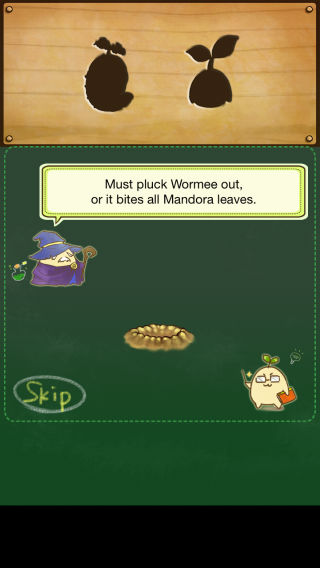
A detailed tutorial for the Mandora app, a game interface.
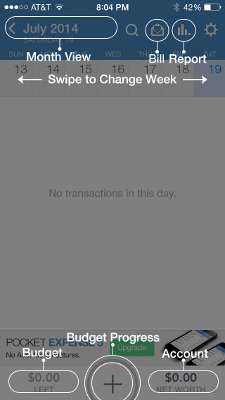
A simple one-screen tutorial for a business app
Take the time to download at least five apps in the genre you are targeting and ask yourself:
- Does my app deviate significantly from them? If so, is it in a good way?
- How are these apps monetizing themselves? Does mine fit into the general strategy?
- Within this sample set, where does my app stand out, and is it doing so in an innovative way that will intrigue my users without annoying them?
3. Don't Do Monetization on the Fly
In-app purchases are a critical monetization strategy for free apps. It can be tricky, however, to not make your app look like a cash register or to always be begging for upgrades. Initially I included one option for in-app purchases - to send a copy of the "Roomalyzed" room painting and remove ads. In subsequent upgrades I included two new panels, one for lighting and another for plants, as additions to decorate rooms, available via in-app purchase.
It would have been a smarter strategy to include one central ‘store' location where the user can see exactly what is for sale in the app and decide whether or not to use it. And when you launch your app and get that initial rush of downloads, a solid IAP strategy will surely pay off.
Before you even begin building your free app, ask yourself:
- How am I going to monetize this?
- How much am I depending on ads to bring in revenue?
- Are my in-app purchase points well defined and is the purchasing process smooth?
- Take a look at the top free apps, sorted by revenue, on App Annie. Download one of them, and see how they are monetizing. Maybe you can get some ideas.
- Consider releasing a free and paid version of your app if it makes sense within your overall strategy.
4. Don't Forget to Test Your Ads
I had no experience with ad networks. Before Roomalyzr, I avoided placing ads in my apps as I feel they have no place in fitness apps, where they can be a distraction, nor in educational apps, which often target a young audience. This lack of experience meant that I made every mistake in the book with regard to ad placement in my app.
Initially, I included full-screen video ads delivered by Vungle which I naively thought would provide a 'one-and-done' experience to my users. My most vicious negative reviews, however, were triggered by these interstitials. Clearly for this genre of app, this is the wrong type of ad. While full-screen interstitials can be used effectively in games which often have a pause-point for an ad to be shown, in a workflow or wizard-type interface like Roomalyzr's, which is built to encourage art creation, they are maddeningly distracting.

An example of a full-screen interstitial ad (MadGods app)
Switching to iAds served by Google solved the problem, but the placement of the ad remains a challenge. I chose to put them as banners on top of the screen except when panels are placed as window-shade style pull-downs at the top or the photo screen is displayed. Even so, one reviewer complained that sometimes the ads load with a delay and can actually cover the tool panel, blocking core functionality. In addition, it seems that ads do better when placed at the bottom of the screen, so in a future iteration of the app I plan to move the navigation off-screen and allow an ad to show throughout the app experience when placed on the bottom.
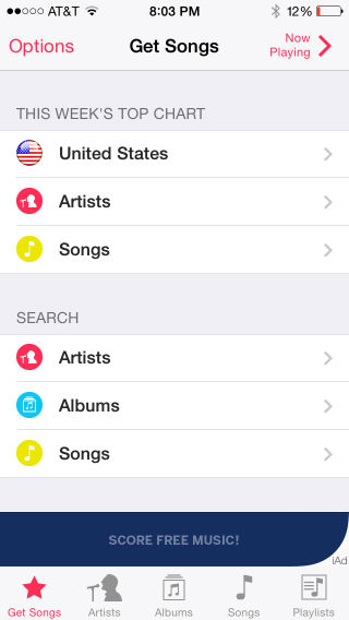
An example of a banner ad at the bottom, above the nav (PocketTube app)
Think hard about ads!
- Where are you going to put them?
- Do you want interstitials, video ads, banner ads, or Kiip-style rewards?
- Think about apps you use that have good ad placement. Where are they placing their banner ads, top, bottom, or middle?
- Can you think of ways to monetize other than ads?
- Be sure to test your ads on various devices, including tablets.
Conclusion
I would say that the launch and maintenance of the various iterations of the Roomalyzr app have been a valuable learning experience for me. Negative feedback, while painful, compels you to evolve your app and your skills. My takeaways from the experience include the need for solid beta-testing, coherent monetization strategy, a clear-eyed choice of ad networks, market research, and inclusion of a tutorial. I'm sure as I continue to develop this and other apps, I'll learn even more lessons. I'd be glad to hear about any of your own experiences!

Jen Looper
Jen Looper is a Developer Advocate for Telerik products at Progress. She is a web and mobile developer and founder of Ladeez First Media which is a small indie mobile development studio. In her spare time, she is a dancer, teacher and multiculturalist who is always learning.
Comments
All articles
Topics
Web Mobile DesktopDesktop
Design
Productivity
People
Latest Stories
in Your Inbox
Subscribe to be the first to get our expert-written articles and tutorials for developers!
All fields are required