
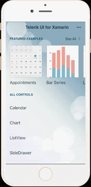
UI for Xamarin Deep Dive: User Productivity with Calendar

This article was co-authored by Rossitza Fakalieva and Sam Basu.
Welcome to Day 4 of our UI for Xamarin article series. Calendars keep our lives organized and productive. Everyone uses them, usually in a digital form. So it is no surprise that your mobile apps may need to display calendars and manage events on them. Turns out, however, that the calendar UI is tricky business - the little details matter.
The Telerik Calendar in UI for Xamarin is designed so you can offer your users ultimate productivity in your apps by implementing various calendar scenarios. And yes, these are truly native calendars on every mobile platform - just rendered through the Xamarin.Forms abstraction.
The Telerik Calendar capitalizes on all the innate benefits of a native UI, but exposes properties/events in C#, allowing developers full customization and flexibility. This article dives head first into leveraging the Telerik Xamarin Calendar and explores all the customization options for developers.
Visual Structure
The Telerik Calendar control offers a lot of customization options and caters to the unique UI paradigms of each mobile platform. Before we start tweaking things, it helps to see the overall big-picture control - the simple rendering of the Telerik Calendar with all visual elements explained.The labels should be self-explanatory.
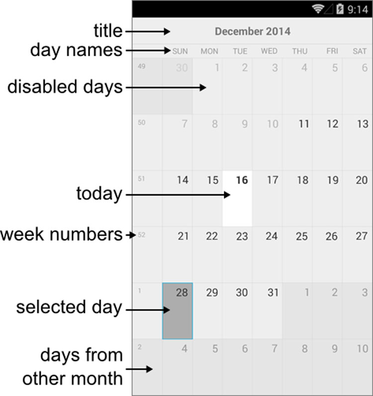
You get some control to show and hide specific details to suit your needs. For example, by default, the day names show up and the week numbers don't. But here's some code to flip both along with the resulting calendar on each mobile platform:
var calendar = new RadCalendar();
calendar.WeekNumbersDisplayMode = DisplayMode.Show;
calendar.DayNamesDisplayMode = DisplayMode.Hide;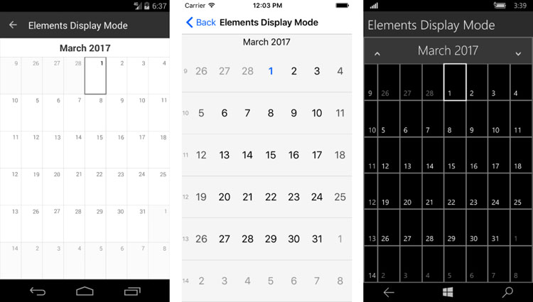
ViewMode
The Telerik Calendar has several supported View Modes that control how the calendar is initially rendered, namely:
- Month
- Week
- Year
- MonthNames
- YearNumbers
- Flow
Not every view mode is supported on all mobile platforms, with only iOS having the distinction of sporting them all. There are some methods exposed for changing up view modes programmatically. Each of these return true if there is support or if navigation is possible, or else they return false:
- TrySetViewMode: Sets the Calendar to a specific view mode.
- TryNavigateToUpperView: Navigates calendar to upper view if possible.
- TryNavigateToLowerView: Navigates calendar to lower view if possible.
The hierarchy of navigation among the view levels is mobile platform dependent, like so:
- iOS - YearNumbers > Year > MonthNames > Month > Week
- Android - Year > Month > Week
Here's some simplistic code to instantiate a calendar and set the view mode to year - all programmatically:
var calendar = new RadCalendar();
calendar.NativeControlLoaded += CalendarLoaded;

private void CalendarLoaded(object sender, EventArgs args)
{
    (sender as RadCalendar).TrySetViewMode(CalendarViewMode.Year);
}
Date Management
The Telerik Calendar exposes properties that allow the developer programmatic flexibility to manipulate the calendar user experience:
- DisplayDate: A date in the current view.
- MinDate: Gets/Sets the minimum date that could be displayed or selected.
- MaxDate: Gets/Sets the maximum date that could be displayed or selected.
Each of the date properties can be set explicitly or relative to current date, like so:
// XAML Markup
<xmlns:TelerikInput="clr-namespace:Telerik.XamarinForms.Input;assembly=Telerik.XamarinForms.Input" />

<TelerikInput:RadCalendar x:Name="MyCalendar" />
// Code Behind
MyCalendar.MinDate = DateTime.Today.AddMonths(-1);
MyCalendar.MaxDate = DateTime.Today.AddMonths(5);
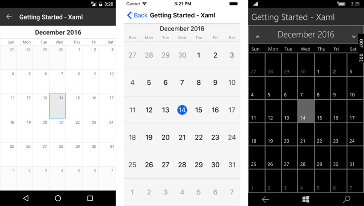
MyCalendar.DisplayDate = DateTime.Today.AddMonths(2);What do users want to do most with a Calendar? They want to select dates, of course. The Telerik Calendar sports a simple date selection functionality - both through user interaction and programmatically. And date selections can be single, multiple or a range of dates. Two key things make this possible:
- SelectedDate: Gets/Sets currently selected date.
- SelectionChanged: Event raised when the selected date is changed.
Here's some basic code that sets up the calendar to display the default month view mode and selects a date programmatically:
RadCalendar calendar = new RadCalendar();
calendar.SelectedDate = new DateTime(2016, 12, 14);
And here's the result - notice the style differences in the calendar controls rendered across different mobile platforms.
Appointments
Any calendar UI needs to display appointments - that's how you keep your users engaged and productive. Appointment support in the Telerik Calendar begins with the Telerik.XamarinForms.IAppointment interface which sports three basic members - StartDate, EndDate and Title. You should definitely consider adding more descriptors to your appointments as needed - a sample Appointment class implementing the interface is below:
public class Appointment : IAppointment
{
    public DateTime StartDate { get; set; }
    public DateTime EndDate {  get; set; }
    public string Title { get; set; }

    public bool IsAllDay { get; set; }
    public Color Color { get; set; }
}
A collection of appointments, all stemming from an IAppointment interface implementation, can be fed to the Telerik Calendar control directly. Simply use the AppointmentSource property, which can also be data bound.
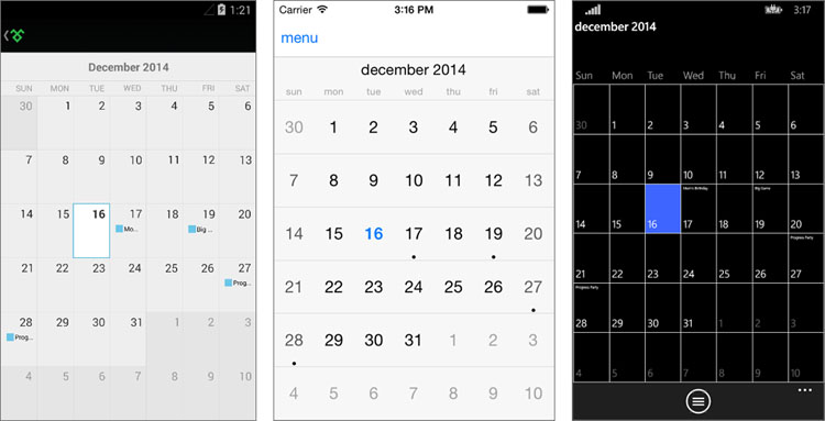
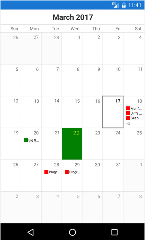
Here are some sample appointments being bound to the calendar and the corresponding results in each platform:
calendar.AppointmentsSource = new List<Appointment>() {
new Appointment() {
    StartDate = DateTime.Today.AddDays(1),
    EndDate = DateTime.Today.AddDays(2).AddTicks(-1),
    Title = "Mom's Birthday",
    Color = Color.Red },
new Appointment() {
    StartDate = DateTime.Today.AddDays(3).AddHours(17),
    EndDate = DateTime.Today.AddDays(3).AddHours(22),
    Title = "Big Game",
    Color = Color.Green },
new Appointment() {
    StartDate = DateTime.Today.AddDays(11).AddHours(20),
    EndDate = DateTime.Today.AddDays(12).AddHours(4),
    Title = "Progress Party",
    Color = Color.Red }
};
Here's a quick look at how professional Telerik Calendar appointments can look like through the Telerik UI for Xamarin Examples app - find the app in your respective App Stores.
Custom Cell Styling
Sure the Telerik Calendar has a polished UI, but there are times when you may want to customize its look and feel and manipulate the tiniest details. And in true developer-friendly form, the Telerik Calendar allows you to have custom styles for each cell.
You can set a property called SetStyleForCell to a custom function that can style individual Calendar cells. All cells share a common base class - the CalendarCell, with the following properties:
- Text: Gets the text displayed in the cell.
- Type (CalendarCellType): Gets the type of the cell. The possible values are:
- Date: All cells that correspond to actual dates have this type
- WeekNumber: Cells that hold week numbers
- DayName: Cells that hold the days of the week
And each cell can be styled using the CalendarCellStyle class, which has the following options:
- BackgroundColor
- BorderColor
- BorderThickness
- FontSize
- FontWeight
- ForegroundColor
Armed with cell styling flexibility, let's say you want to color the first day of spring to be a green cell in the Calendar - here's how:
var calendar = new RadCalendar();
calendar.SetStyleForCell = this.EvaluateCellStyle;

private CalendarCellStyle EvaluateCellStyle(CalendarCell cell)
{
    var springStyle = new CalendarCellStyle { BackgroundColor = Color.Green, FontSize = Device.OnPlatform(14, 30, 17), FontWeight = FontWeight.Normal, ForegroundColor = Color.FromRgb(139, 209, 0)};
    var dayCell = cell as CalendarDayCell;

    if (dayCell != null && dayCell.Date.Day == 22 && dayCell.Date.Month == 3)
    {
        return springStyle;
    }
    return null;
}
And the result:
Another common customization opportunity may arise with appointments - you may have a need to custom style appointments on a busy calendar. With the Telerik Calendar, you get an AppointmentStyle property which is of the type CalendarAppointmentsStyle. This allows for complete, color-coded customization of appointments with text and shapes.
Here's the visual structure of appointment styling in calendar cells. You can use text or shape or both.
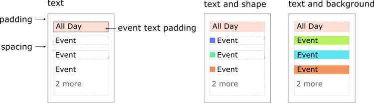
Some of the styling opportunities with CalendarAppointmentsStyle have the following properties:
- DisplayMode: Defines how appointments are visualized. Values can be
- Text
- TextWithShape
- TextWithBackground
- Shape
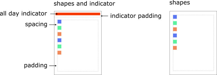
- Padding: Defines the padding of the rectangle that holds the events.
- Spacing: Defines the empty space between two appointments in the same date.
- ShapeType: Defines the shape representing an appointment. Values can be
- Rectangle
- Ellipse
- TriangleUp
- TriangleDown
- Rhombus
- AllDayIndicatorLocation: Defines the location where the all day indicators are visualized.
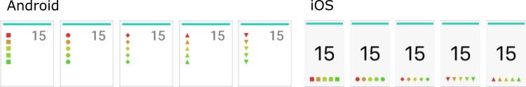
Some examples of how shapes representing appointments can be visualized are shown below:
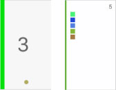
An example of an all-day appointment indicator is below - you get to control the location, width and padding of how the indicator is rendered in the calendar cell:
Conclusion
Telerik Xamarin Calendar is a complex piece of UI with lots of features. Just know that when you need to support any type of calendars and events in your cross-platform mobile app, the Telerik Calendar stands ready out of the box - with a myriad of customization options. Look through the detailed docs when you are ready. Keep your users productive with the right calendar support. Cheers!
Other articles in this series:

Rossitza Fakalieva
Rossitza Fakalieva is a Technical Manager, Microsoft MVP in Developer Technologies and a Director of the Bulgarian chapter of the global Women Who Code organization. She previously worked on the Telerik engineering team and defines herself as .NET enthusiast. She loves to empower others to grow in their career and in the tech field—by teaching, by delivering courses and presentations, and as part of her daily job.
Related Posts
Comments
All articles
Topics
Latest Stories
in Your Inbox
Subscribe to be the first to get our expert-written articles and tutorials for developers!
All fields are required