
UI for Xamarin Deep Dive: Must-Have Interactivity with ListView

Welcome to Day 2 of our UI for Xamarin series. Hope you have started off on the right foot and have your ammunition all set. Let's take on a hard-hitting must-have UI control today!
As is the case, most mobile apps often need to display a list of things. This list needs to be completely customizable to present content in a way that fits the app's needs, but it also need to have high performance for scrolling. Modern app users also expect lists to support a plethora of touch interactivity, thus demanding a high level of gesture support and feature-richness from a given list.
Most often, the developer's choice of UI control to render a modern list of things is the ubiquitous ListView. Sure you can start with the vanilla ones and build features of your own – but wouldn't you rather focus on your app's functionality than sweating over perfecting the ListView's interactivity?
The ListView in Telerik UI for Xamarin comes packed with features and gesture support, so that you don't have to reinvent the wheel. This is where the huge engineering efforts shine through - a polished ListView that you can just drop in your app and immediately light up modern features. Keep in mind: when you use the Telerik ListView in your Xamarin.Forms app, it is turning around to render native ListViews custom-built for iOS, Android and Windows. This article dives into some of the features of the ListView and how you leverage them in your apps.
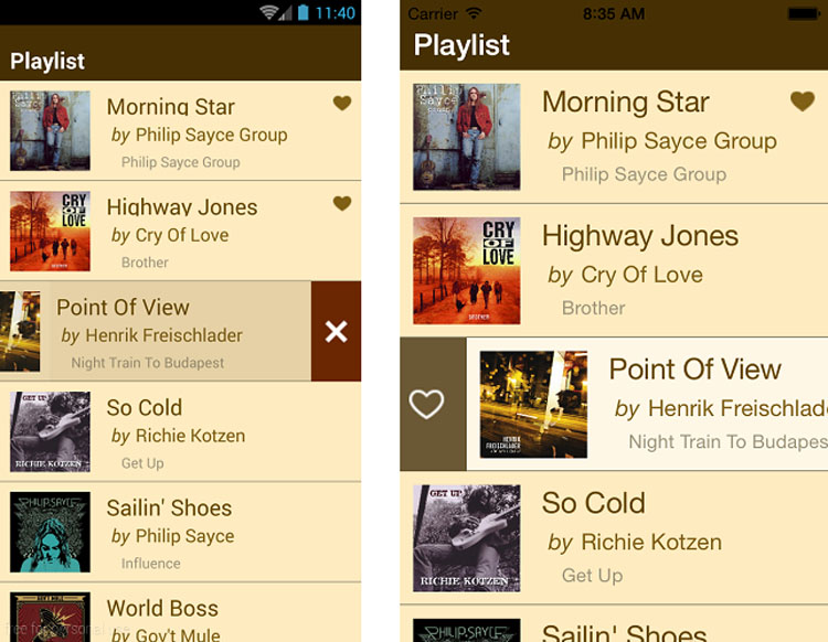
Cell Swipe
Your app users will invariably want to interact with the rows in your ListView. What happens if I swipe right or left? With the Telerik ListView, you have built-in support for swipe gestures – the content view simply moves over for actions or interactive buttons, with completely customizable experiences.
Once enabled, you get to control the swipe threshold and offset – to customize exactly how the user interactivity should behave. You also get to respond to several events as they relate to the swipe – when it starts, when it is happening and when it ends, all with corresponding event arguments. These events can be used in conjunction with the swipe direction or swiped distance to either take decisive action on the data item or reveal interactive content, as desired by your app.
Let's look at some XAML markup that renders the ListView and sets up content to be revealed on cell swipe:
<TelerikDataControls:RadListView x:Name="BusinessJetsList"
                               IsItemSwipeEnabled="True" SwipeThreshold="10" SwipeOffset="70, 0, 0, 0">
    <TelerikDataControls:RadListView.ItemTemplate>
        <DataTemplate>
        ...
        ...
        </DataTemplate>
    </TelerikDataControls:RadListView.ItemTemplate>
    <TelerikDataControls:RadListView.ItemSwipeContentTemplate>
        <DataTemplate>
            <Grid Padding="0" Margin="0" RowSpacing="0" ColumnSpacing="0">
                <Grid.ColumnDefinitions>
                    <ColumnDefinition Width="70" />
                    <ColumnDefinition Width="*" />
                </Grid.ColumnDefinitions>
                <Button Text="Book" Clicked="Book_BizJet" WidthRequest="70" BorderRadius="0" Margin="0" />
            </Grid>
        </DataTemplate>
    </TelerikDataControls:RadListView.ItemSwipeContentTemplate>
</TelerikDataControls:RadListView>
Notice the ItemSwipeContentTemplate? That gives you complete control over the content you want to show on cell swipe - in this case, a simple button in a grid. And all UI controls in the swiped content can have their own decorators and event handlers - just part of the visual tree when swiped. The cell swipe interactions are commonly used to flag/delete items in the ListView – you get event notifications to adjust the underlying data collection accordingly.

Selections
When you present rows of content in a ListView, what do your users want to do - of course, select. The Telerik ListView handles selections efficiently providing visual and programmatic feedback to user actions, as showcased in the UI for Xamarin Examples app in respective Stores.
There are some ListView properties/events exposed for developers that specifically deal with user selections:
- SelectionGesture: Controls what triggers the selection | Values -
Tap/Hold - SelectionMode: Controls the selection mode | Values -
None/Single/Multiple - SelectedItem: Gets the last selected item | Type -
Object - SelectedItems: Gets/sets the currently selected items | Type -
ObservableCollection of Objects - SelectionChanged: Event triggered when SelectedItems collection changes
A very likely scenario when the user selects an item from the ListView is to show additional information or navigate to another part of the app. A simple event handler suffices, like in the code below:
<TelerikDataControls:RadListView x:Name="MyListView" SelectionMode="Single"
                                 ItemTapped="Item_Selected"
...
</TelerikDataControls:RadListView>
Styling
It shouldn't be a surprise that a modern ListView would allow developers complete flexibility in data presentation and how each of the row cells are styled. The Telerik ListView does not disappoint on this either, with freeform templates and styling options.
Let's look at some code:
<TelerikDataControls:RadListView x:Name="MyListView">
    <TelerikDataControls:RadListView.ItemStyle>
        <TelerikListView:ListViewItemStyle BackgroundColor="Transparent" BorderLocation="None"/>
    </TelerikDataControls:RadListView.ItemStyle>
    <TelerikDataControls:RadListView.ItemTemplate>
        <DataTemplate>
            <TelerikListView:ListViewTemplateCell>
                <TelerikListView:ListViewTemplateCell.View>
                     <StackLayout Orientation="Horizontal" Padding="20">
                        ...
                        ...
                      </StackLayout>
                </TelerikListView:ListViewTemplateCell.View>
            </TelerikListView:ListViewTemplateCell>
        </DataTemplate>
    </TelerikDataControls:RadListView.ItemTemplate>
</TelerikDataControls:RadListView>
The ItemTemplate defines how each of the ListView items should present themselves - each cell is completely customizable with full templating support. The ItemStyle contains styles that apply to the ListView as a whole, like borders and background colors.
If allowing selections, each selected item can be styled, like so:
<TelerikDataControls:RadListView.SelectedItemStyle>
        <TelerikListView:ListViewItemStyle BackgroundColor="#E5EDF3" BorderWidth="3" BorderLocation="Bottom"/>
</TelerikDataControls:RadListView.SelectedItemStyle>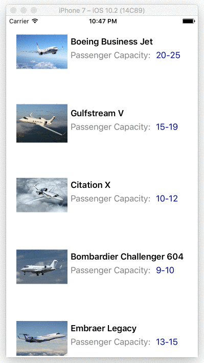
Reorder
Want users to be able to shuffle items around in the ListView and reorder the list? Simple - just turn on a setting on the Telerik ListView, as shown. As the user moves items around, it is reflected not just in the UI, but also in the underlying data set that the ListView is bound to.
<TelerikDataControls:RadListView x:Name="MyList" IsItemsReorderEnabled="true">
    ..
    ..
</TelerikDataControls:RadListView>
Pull to Refresh
Your first ask with a ListView may be to bind it to some data and display a nicely formatted list of items. But what if your collection changes on the fly after the initial load? Your users will want to see the data refreshed and will expect pull-to-refresh gesture to be supported.
With the content scrolled to the top, swipe a finger down – the Telerik ListView supports pull-to-refresh out-of-the-box, including a custom animated refresh indicator on each mobile platform.
Here's how to enable the feature in the Xamarin.Forms XAML markup declaration for the ListView:
<TelerikDataControls:RadListView x:Name="MyListView"
                                 IsPullToRefreshEnabled="true" RefreshRequested="DataRefresh_Requested">
    <TelerikDataControls:RadListView.ItemTemplate>
        ...
        ...
    </TelerikDataControls:RadListView.ItemTemplate>
</TelerikDataControls:RadListView>
So just turning on a setting enables the pull to refresh feature on the Telerik ListView. You get a simple event handler to respond to when the user triggers the feature, like shown below. Remember to call the EndRefresh() method to indicate that your data fetching is done .. the ListView will automatically collapse the refresh indicator.
private void DataRefresh_Requested(object sender, PullToRefreshRequestedEventArgs e)
{
    // Custom refresh logic goes here.
    this.MyListView.EndRefresh();
}
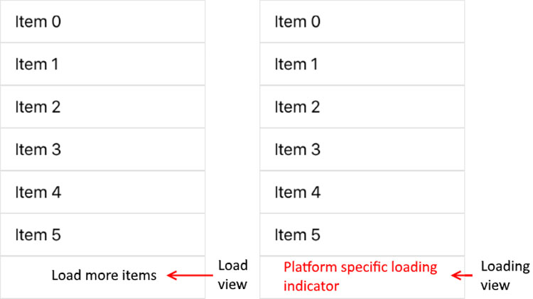
Virtualization with Load on Demand
We all know shipping a huge amount of data to the client side on a mobile app isn't recommended, yet there aren't any warnings before you shoot yourself in the foot. What if you bind your ListView to 100K records of data items, each with a fancy item template for display?
While not recommended, if you do end up with massive data binding/rendering payload, your UI should be smart enough to handle it, instead of bringing the app down to its knees. The Telerik ListView can handle this graciously with built-in load on demand. It supports intelligent, incremental data loads before item visualization when bound to a large data set.
Load on demand has two modes:
- Automatic – Data is requested automatically when user scrolls near end of visualized items.
- Manual – Data is requested explicitly by clicking on a button rendered near the end of visualized items.
To enable load on demand, simply turn on a setting for the ListView in your XAML markup, along with the desired mode. You'll get an event to respond to and add fresh data to the bound UI collection.
<TelerikDataControls:RadListView x:Name="MyListView"
                                 IsLoadOnDemandEnabled="true" LoadOnDemandMode="Automatic" LoadOnDemand="MyListView_LoadOnDemand">
    <TelerikDataControls:RadListView.ItemTemplate>
        ...
        ...
    </TelerikDataControls:RadListView.ItemTemplate>
</TelerikDataControls:RadListView>
// Code Behind
private void MyListView_LoadOnDemand(object sender, EventArgs e)
{
CustomObject lodObject = new CustomObject(<InitializationParameters>);
(this.MyListView.ItemsSource as ObservableCollection<CustomObject>).Add(lodObject);
}
You could alternatively manage the data loading from your ViewModel itself through a custom ListViewLoadOnDemandCollection collection object, as well as manage the number of preloaded items and change the appearance of the manual load button – the ListView performs with the same aplomb.
Layouts
The Telerik ListView supports two layout modes:
- Linear - A stack of things - the default ListView mode
- Grid - Distributed cells in fixed number of rows/columns
Each layout mode is interchangeable to suit specific device form factors or app needs and is controlled through the LayoutDefinition property.
Here's explicitly setting the ListView to Linear:
<TelerikDataControls:RadListView.LayoutDefinition>
    <TelerikListView:ListViewLinearLayout VerticalItemSpacing="2" ItemLength="40"/>
</TelerikDataControls:RadListView.LayoutDefinition>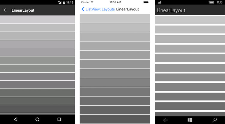
And here's the Grid mode:
<TelerikDataControls:RadListView.LayoutDefinition>
    <TelerikListView:ListViewGridLayout VerticalItemSpacing="5" HorizontalItemSpacing="5" SpanCount="2" ItemLength="120" />
</TelerikDataControls:RadListView.LayoutDefinition>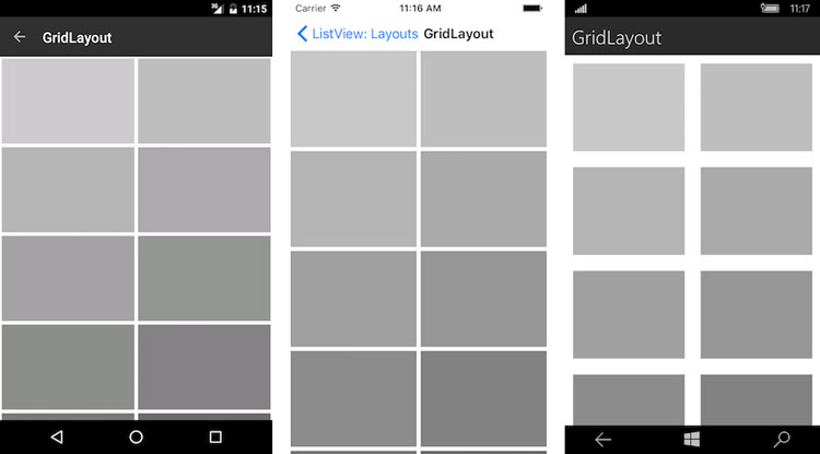
You can use the layouts specifically or interchangeably, as demonstrated in our Store UI for Xamarin Examples app. Play around with what works for your app and delight users.
Conclusion
A ListView is one of the most ubiquitous UI controls, since most apps need to commonly display a list of things. Modern users of your app will naturally expect common gestures from your list UI, and you'll want to deliver without spending a ton of time perfecting UI features.
If you're using the Telerik ListView, you'll get most features and gesture support built-in – simply enable them in your app, respond to events and manage your data binding with underlying collection. There are several more features of the Telerik ListView that we did not get to cover - like Sorting, Filtering and Grouping. You should bookmark the docs for a complete rundown of supported ListView features and how to leverage them in your apps. ListView should not longer be the bottleneck for your app's UI to be fluid - your users will thank you.
Other articles in this series:

Sam Basu
Sam Basu is a technologist, author, speaker, Microsoft MVP, gadget-lover and Progress Developer Advocate for Telerik products. With a long developer background, he now spends much of his time advocating modern web/mobile/cloud development platforms on Microsoft/Telerik technology stacks. His spare times call for travel, fast cars, cricket and culinary adventures with the family. You can find him on the internet.
Related Posts
Comments
All articles
Topics
Latest Stories
in Your Inbox
Subscribe to be the first to get our expert-written articles and tutorials for developers!
All fields are required