
Adding a Pivot Table to HTML5 Apps

I am going to start this blog post by asking you couple of questions. Have you ever had a requirement that asked questions like...
- Can you show how many pieces we sold in every region for every shipping date?
- Can you show all employees with sum of all the time off that they have taken and grouped by type?
- Can you show a list of salespeople with the sum of all their sales and the items that they sold?
And what's more, you are typically supposed to do this using a table in your HTML5-based apps. I bet many people have been in this situation at least once in their careers. I have personally been in this situation on many occasions
To better solve this problem, I want to show how you can show to add a pivot table in your HTML5 based web apps. So let's take a ride, shall we?
What is Pivot Table?
According to Wikipedia, a pivot table is defined as follows:
"In data processing, a pivot table is a data summarization tool found in data visualization programs such as spreadsheets or business intelligence software. A pivot table can automatically sort, count total or give the average of the data stored in one table, displaying the results in a second table showing the summarized data"_
So, whenever you need some sort of summarized data with the sum/average of the column, you need a Pivot Table. A typical data table expresses the data in two dimensions - i.e. rows & columns. A Pivot Table allows you to visualize data in multidimensional view in a cross-tabular format.
Pivot Table Mechanics
Typically Pivot Tables use what is known as On Line Analytical Processing concept (OLAP) to represent multidimensional data. OLAP allows you to access aggregated multidimensional structures called cubes.
A cube is basically a data set which is organized in a multidimensional manner with zero or more dimensions. With cubes we can perform different operations and complex analytical queries on multidimensional data. If your OLAP data source needs to be exposed over the web, access is managed using a protocol named XMLA or XML for Analysis.I am not going to get deep into how to work with OLAP cubes.
While you may not be familiar with the inner workings of pivot tables, you might be familiar with Microsoft Excel and creating pivot table inside a spreadsheet. Let's see how we can bring that experience to HTML5 applications.
Introducing Kendo UI Pivot Grid
Kendo UI is one of our flagship products. Kendo UI contains web, data visualization and mobile Widgets. You can learn more about Kendo UI here. You can play around with the demos here.
Kendo UI Pivot Grid is a new control which represents the multidimensional data in a cross-tabular format. Using Pivot Grid, you will be able to visualize data in multi-dimensions and perform complex analysis on the data. Pivot Grid also uses the OLAP approach for working with multidimensional data - i.e. cubes.
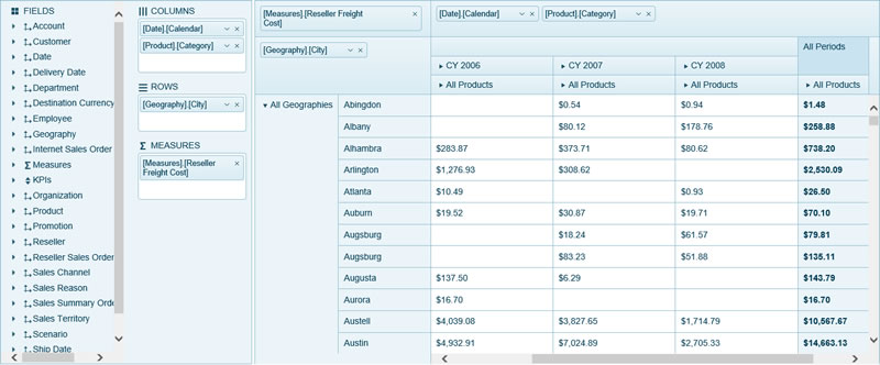
Fig 1: Kendo UI Pivot Grid
Pivot Grid has the capability to drill-down on the underlying data and provide calculation for the cells.
Pivot Grid Data Source
Pivot Grid is powered by our data source component called PivotDataSource. PivotDataSource has the apability to connect to an OLAP cube instance which is available online over HTTP using the XMLA protocol. We can also instantiate a new PivotDataSource and provide that as the data source to the Pivot Grid widget.
If we do not have an OLAP cube over HTTP but we have local data that needs to be pivoted then we provide the local data as a data source. The Pivot Grid Widget will initialize a PivotDataSource from the provided local data. Whether we bind to remote data or local data you will need to let the data source know what fields go to rows and columns and what fields to use as a measure (for aggregation).
Pivot Grid with an OLAP Data Source Over HTTP
For the sake of this article, I will be using a demo OLAP server we have set up here. We have set up an OLAP cube data source which connects to the "Adventure Works" database on our demo server. You can use this to play around with Pivot Grid.
So let's get started with the code:
-
Define a
divthat will hold the Pivot Grid widget.<div id="pivotgrid"> </div> -
Next, configure the Kendo Pivot Grid. We will instantiate a Pivot Grid widget and set the data source to our OLAP server available at our demo server.
<script>
     $(document).ready(function () {
         $("#pivotgrid").kendoPivotGrid({
             height: 200,
             dataSource: {
                 type: "xmla",
                 columns: [{ name: "[Date].[Calendar]" }],
                 rows: [{ name: "[Product].[Category]" }],
                 measures: ["[Measures].[Internet Sales Amount]"],
                 transport: {
                     connection: {
                         catalog: "Adventure Works DW 2008R2",
                         cube: "Adventure Works"
                     },
                     read: {
                         url: "http://demos.telerik.com/olap/msmdpump.dll",
                         dataType: "text",
                         contentType: "text/xml",
                         type: "POST"
                     }
                 },
                 schema: {
                     type: "xmla"
                 },
             }
         });
     });
 </script>
Let's take a closer look at the data source definition
- We set the
typeof the data source to XMLA. - Set the fields that we would like to see in the Pivot Grid Column dimension.
- Set the fields that we would like to see in the Pivot Grid Row dimension.
- Define the measures that we would like to see. In our demo OLAP cube we have a measure defined by name called "Internet Sales Amount".
- The important thing is the transport setting. We set the catalog and cube name to which we will make the connection. We also provide the URL from where the data needs to be read. In our case it is https://demos.telerik.com/olap/msmdpump.dll.
- Finally, set the schema type of the data source to XMLA. This will determine the shape of the data that will be coming through.
- We set the
That's all it takes to set up a Pivot Grid connected to an OLAP Cube over http. Here is the output of above code:
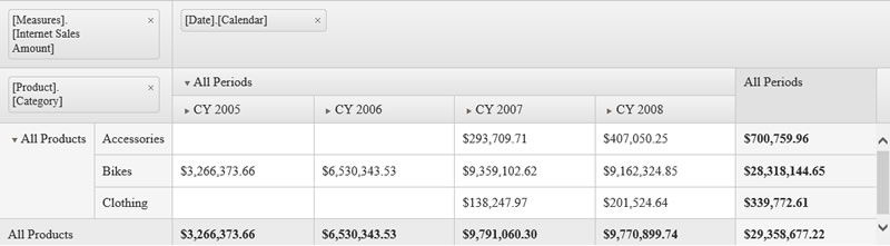
Fig 2: Pivot Grid connected to OLAP Cube over HTTP
Pivot Grid with a Remote ODATA Service
In the previous section, we saw a demo of Pivot Grid connected to OLAP Cube over HTTP. What if you don't have an OLAP cube set up, but you have a hosted service which contains flat data that you want to pivot over?
Well, one of the advantages of using Kendo UI Pivot Grid is that you can define your dimensions (i.e. rows and columns) and measures against your flat data on the client side and Pivot Grid will do the rest for you.
So let's look at an example of connecting to the Northwind OData service > Customers collection. We want to pivot this flat data to figure out how many contacts are available under each job title across countries and companies.
-
Define a
divelement that will hold the Pivot Grid widget.<div id="pivotgrid"> </div> -
Configure the Kendo Pivot Grid. We will instantiate a Pivot Grid widget and set the data source to the OData service hosted online.
<script>
     $(document).ready(function () {
         var pivotgrid = $("#pivotgrid").kendoPivotGrid({
             columnWidth: 120,
             height: 570,
             dataSource: {
                 type: "odata",
                 transport: {
                     read: "http://demos.telerik.com/kendo-ui/service/Northwind.svc/Customers"
                 },
                 schema: {
                     cube: {
                         dimensions: {
                             ContactName: { caption: "All Contacts" },
                             CompanyName: { caption: "All Companies" },
                             Country: { caption: "All Countries" },
                             ContactTitle: { caption: "All Titles" }
                         },
                         measures: {
                             "Contacts Count": { field: "CustomerID", aggregate: "count" }
                         }
                     }
                 },
                 columns: [{ name: "Country", expand: true }, { name: "CompanyName" } ],
                 rows: [{ name: "ContactTitle", expand: true }],
                 measures: ["Contacts Count"]
             }
         }).data("kendoPivotGrid");
     });
 </script>
Let's discuss a couple of things regarding the above code:
- We set the
typeof the data source to odata. We do this to let the data source know that it will working with an Odata service and that it should use Odata lingo during communication. - We use the transport setting to provide the end point from which data will be read.
- Use the schema setting of data source to define the dimensions and measure. Using the dimensions settings, we can create different the dimensions that we need. The measures setting allows us to provide the column which we need to aggregate. In this example, I am using a count of all customer IDs.
- Set the columns that the Pivot Grid should display.
- Set the rows that we need in the Pivot Grid.
- Finally, set the measure we need to be shown in the cells.
- We set the
Here is the output of the above code:
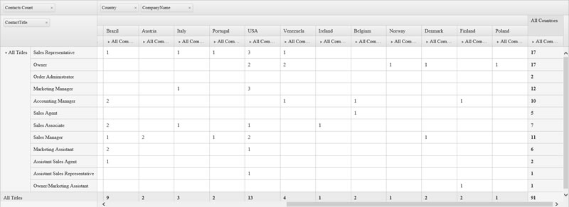
Fig 3: Kendo UI Pivot Grid connected to OData Service
Pivot Grid with Local Data
So far we have seen how to connect to an OLAP Cube over HTTP & Remote data and pivot the data using Pivot Grid. But what about local data? What I mean by local data is – let's say you have a local JavaScript array that holds some shape of data and you want to pivot on that. For example, we have an array of employee time off data and want to pivot on it to find the sum of time off taken by each employee by type of time off.
It's pretty easy to bind local data to pivot grid. We'll follow the same procedure as we did for remote data. Instead of setting the data source type and transport read settings, we will just set the data property of the data source to a JavaScript array. Here is the JavaScript array for employee leaves data for this example:
var leaveData = [
    {
        Employee:"Jane",
        Start: new Date(2014,3,17),
        End: new Date(2014,3,17),
        Type:"Sick Leave",
        Days:1
    },
    {
        Employee:"Jane",
        Start: new Date(2015,0,2),
        End: new Date(2015,0,2),
        Type:"PTO",
        Days:1
    },
    {
        Employee:"Jane",
        Start: new Date(2015,0,10),
        End: new Date(2015,0,10),
        Type:"Sick Leave",
        Days:1
    },
    {
        Employee:"Jane",
        Start: new Date(2015,0,27),
        End: new Date(2015,0,27),
        Type:"PTO",
        Days:1
    },
    {
        Employee:"Jane",
        Start: new Date(2014,4,5),
        End: new Date(2014,4,5),
        Type:"PTO",
        Days:1
    },
    {
        Employee:"Jane",
        Start: new Date(2014,5,30),
        End: new Date(2014,5,30),
        Type:"Sick Leave",
        Days:1
    },
    {
        Employee:"Jane",
        Start: new Date(2014,5,30),
        End: new Date(2014,5,30),
        Type:"Sick Leave",
        Days:1
    },
    {
        Employee:"Jane",
        Start: new Date(2014,6,8),
        End: new Date(2014,6,8),
        Type:"Sick Leave",
        Days:1
    },
    {
        Employee:"John",
        Start: new Date(2014,7,1),
        End: new Date(2014,7,1),
        Type:"Sick Leave",
        Days:1
    },
    {
        Employee:"John",
        Start: new Date(2014,4,8),
        End: new Date(2014,4,14),
        Type:"PTO",
        Days:5
    },
    {
        Employee:"John",
        Start: new Date(2014,9,22),
        End: new Date(2014,9,24),
        Type:"PTO",
        Days:2
    },
    {
        Employee:"John",
        Start: new Date(2014,11,26),
        End: new Date(2014,11,26),
        Type:"PTO",
        Days:1
    },
    {
        Employee:"John",
        Start: new Date(2015,0,2),
        End: new Date(2015,0,2),
        Type:"PTO",
        Days:1
    },
    {
        Employee:"John",
        Start: new Date(2015,1,23),
        End: new Date(2015,1,27),
        Type:"PTO",
        Days:5
    },
    {
        Employee:"Jack",
        Start: new Date(2014,7,18),
        End: new Date(2014,7,18),
        Type:"PTO",
        Days:1
    },
    {
        Employee:"Jack",
        Start: new Date(2014,7,22),
        End: new Date(2014,7,22),
        Type:"PTO",
        Days:1
    },
    {
        Employee:"Jack",
        Start: new Date(2014,7,25),
        End: new Date(2014,7,27),
        Type:"Sick Leave",
        Days:3
    },
    {
        Employee:"Jack",
        Start: new Date(2014,4,2),
        End: new Date(2014,4,6),
        Type:"PTO",
        Days:3
    },
    {
        Employee:"Jack",
        Start: new Date(2015,0,22),
        End: new Date(2015,0,23),
        Type:"PTO",
        Days:2
    }
];
And here is the Pivot Grid definition:
$(document).ready(function () {
    var pivotgrid = $("#pivotgrid").kendoPivotGrid({
        columnWidth: 120,
        height: 275,
        dataSource: {
            data: leaveData,
            schema: {
                model: {
                    fields: {
                        Employee: { type: "string" },
                        Start: { type: "date" },
                        End: {  type: "date" },
                        Type: { type: "string" },
                        Days: { type:"number" }
                    }
                },
                cube: {
                    dimensions: {
                        Employee: { },
                        Type: {  }

                    },
                    measures: {
                        "Sum": { field: "Days",aggregate: "sum" }
                    }
                }
            },
            columns:[{name:"Type",expand:true}],
            rows: [{ name: "Employee", expand: true }],
            measures: ["Sum"]
        }
    }).data("kendoPivotGrid");
});
We have set the dimension and measure on the data source schema. We provide what columns, rows and measures that we need the pivot grid to display. Our measure is set to the sum of employee time off. All Employees will be listed as rows and the time off types as columns. The cells intersecting an employee and time off type will have the sum of days off for that employee and that particular time off type.
Here is a screen shot of the employee time off matrix that we just created:
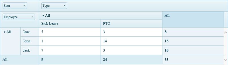
Fig 4: Employee Leave Matrix using Pivot Grid
As you can see, we have created a nice looking time of matrix with local data using a pivot grid.
Pivot Grid Configurator
If you have created Pivot Grid in any software like Microsoft Excel, you will be familiar with a configurator window. The configurator window will list all the dimensions and measures available for you to use from your data source. You can then drag fields around and drop them either on the columns, rows or measures placeholder. This way you can visually configure how you want to see the pivot grid.
Here is what the Excel pivot grid configurator looks like:
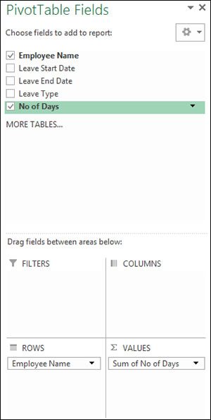
Fig 5: Microsoft Excel Pivot Grid Configurator
Well, with the Kendo UI Pivot Grid we provide a pivot grid configurator widget that will help you configure your Pivot Grid the way that you want it. Let's add a configurator to the employee leave matrix example that we did in the previous section. Here are the steps to add the pivot grid configurator:
-
Add another
divbefore thedivfor the pivotgrid.<!-- HTML Div to hold Pivot Grid Configurator --> <div id="configurator"></div> -
Next, just after the pivot grid initialization, add the following code to initialize configurator:
$("#configurator").kendoPivotConfigurator({
     dataSource: pivotgrid.dataSource,
     height: 330
 });
Below is the output:
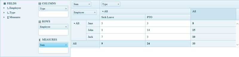
Fig 6: Kendo UI Pivot Grid with Configurator
As you can see it just took me just two lines of code to get the configurator widget next to the pivot grid. That's how easy it can get with Kendo UI.
Conclusion
This was a whirlwind tour of things you can do with Kendo UI Pivot Grid in your HTML5 apps and sites. We are excited to see what you guys come up with using the new widget.
Until next time – happy coding!

The Telerik Team
Comments
All articles
Topics
Latest Stories
in Your Inbox
Subscribe to be the first to get our expert-written articles and tutorials for developers!
All fields are required