
6 Rules for Awesome Data Visualizations with Kendo UI

Michelangelo said that "every block of stone has a statue inside it and it is the task of the sculptor to discover it." The same can be said for data - every bit of data has a story inside it and it is the task of developers building apps to reveal it. We do this through data visualizations, which is all about providing a view into the world of what the data is telling us.
Jer Thorp describes the process of creating data visualizations as "putting data into a human context." Data is everywhere. It's in the applications we build. It's in the services we connect to. Without visualizing it, it can be very difficult for us to derive any context or meaning out of it.
Over the past 4 years, I've been working closely with the data visualization capabilities of Kendo UI. In this article, I'd like to share with you my 6 rules for building awesome data visualizations with Kendo UI.
1. Less is More
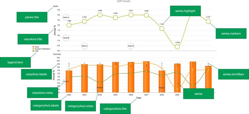
A common mistake I see made is placing too much information in a visualization. Rather than applying the rule of "less is more," many visualizations have too many artifacts, which obscures the data. Artifacts like grid lines, labels, and legends are useful when used appropriately. However, if misused, they can take away from the story being told by the data itself. Let's look at an example using the bar chart of Kendo UI:
See the Pen RWQwwp by John Bristowe (@jbristowe) on CodePen.
This is a live demo so feel free to toggle the options I've chosen to demonstrate. In this example, grid lines are provided to help viewer determine the values of each column. However, they distract attention away from the data, making it more difficult to glean the information it contains. Labels are also applied at the ends of each series. They are redundant since the value axis already displays this information. If an exact value is required, it can be obtained through the tooltip that's present on the series.
2. Be Adaptive
Kendo UI has many built-in capabilities to support building highly responsive websites. Recently, Cody Lindley highlighted them in an excellent article entitled, Kendo UI at Any Screen Size. We all know that it's incredibly important that websites are responsive given the number of mobile devices being used to navigate the web. This is equally important for your data visualizations.
With mobile, the goal is to have data visualizations that look good while preserving the fidelity of the data being shown. This can be achieved through a screen-adaptive approach. Before we examine how this approach works, let's understand why it's important through a demo:
See the Pen Responsive Webpage Obesity with Kendo UI (Non-Responsive) by John Bristowe (@jbristowe) on CodePen.
To be honest,a non-adaptive data visualization is the most common mistake I see developers make when building websites and applications with Kendo UI. Don't let this happen to you!
As it turns out, building an adaptive chart turns out to be pretty easy. Whenever the parent container changes size, you can be selective about what elements you wish to display. This pattern mimics what we do with responsive web design; displaying/hiding elements and reordering grid columns based on changes to the surrounding dimensions.
Let's take another look at the chart I created previously - this time with adaptive capabilities built in:
See the Pen Webpage Obesity by John Bristowe (@jbristowe) on CodePen.
When the pane for the chart is resized, the step count of the category axis labels is dynamically adjusted to provide more spacing. Also, the legend is hidden when the width of the pane passes a certain limit. (Note: You could also have the legend rendered below the chart.) Here's how it works:
function resize() {
  var width = $("#chartPane").width(),
      chart = $("#archiveAreaChart").data("kendoChart"),
      displayLegend = true,
      stepSize = 1;

  if (width <= 320) {
    stepSize = 8;
    displayLegend = false;
  } else if (width <= 480) {
    stepSize = 4;
  } else if (width <= 960) {
    stepSize = 2;
  }

  chart.setOptions({
    categoryAxis: { labels: { step: stepSize } },
    legend: { visible: displayLegend }
  });

  kendo.resize($("#archiveAreaChart"));
}
The resize function is responsible for modifying the configuration of the chart based on the container's width. In this example, I left chart untouched and simply modified the labels and legend. This is an appropriate strategy for a lot of cases. Another approach could change the chart type to something more suitable when dimensions are tight. Whatever you choose to do, the bottom line is this: you have flexibility with Kendo UI to support an adaptive strategy for your data visualizations.
3. Put Custom Visuals to Good Use
Custom visuals (or visual templates) are a powerful capability of Kendo UI. They allow you to change or replace parts of a chart with code to draw visualizations. This is a really nice feature when you want to add some flair to your data visualizations. Futhermore, Kendo UI has a rich drawing API that you can leverage when writing a custom visual.
Custom visuals can be applied at numerous locations:
More recently, we added custom visuals for pie, donut and funnel segments. (You can see an example of a custom visual in a pie chart in a demo below.)
To understand how custom visuals work, let's take a look at a live example. Clicking on the toggle button will enable/disable the custom visuals in the following chart:
See the Pen Custom Visuals with Kendo UI by John Bristowe (@jbristowe) on CodePen.
In this example (above), I've defined custom visuals for the series labels and labels for the category axis. I've done this to provide more context for the data visualization. Instead of country names, why not display their flags? Also, why not align the data labels in a single column to prevent the eye from having to scan back-and-forth? In the case of the former, I defined a custom visual that replaces the country name with an image of its flag:
$("#chart").kendoChart({
  // ...
  categoryAxis: {
    labels: {
      visual: function (e) {
        var rect = new kendo.geometry.Rect(e.rect.origin, [24, 24]);
        var image = new kendo.drawing.Image(/* url */);
        return image;
      }
    }
  }
}
In the case of the latter, I defined a custom visual that aligns the series labels closer to the country flag:
$("#chart").kendoChart({
  // ...
  categoryAxis: {
    labels: {
      visual: function (e) {
        var center = e.rect.center();
        return new kendo.drawing.Text(e.text,
          [45, center.y - 7],
          { fill: { color: "white" } }
        );
      }
    }
  }
}
As you can see, writing a custom visual isn't terribly hard. So why not use them? They'll add a lot of zing to your data visualizations.
4. Let's Dashboard It!
Kendo UI has supported a framework for building dashboards for a long time. In fact, Burke Holland wrote about it last year in a detailed article entitled, Customizable Dashboards With Angular Kendo UI and Bootstrap. Applying rules 1 & 2 (above), we can start to create some pretty nice looking dashboard widgets:
See the Pen Webpage Obesity by John Bristowe (@jbristowe) on CodePen.
This is another live example to demonstrate what's possible with Kendo UI. You can have dashboard widgets that dynamically update in real-time, leverage custom visuals to provide more context, and apply a "less is more" approach to design. A good example of this can be seen in the analytics section of the Telerik Platform:
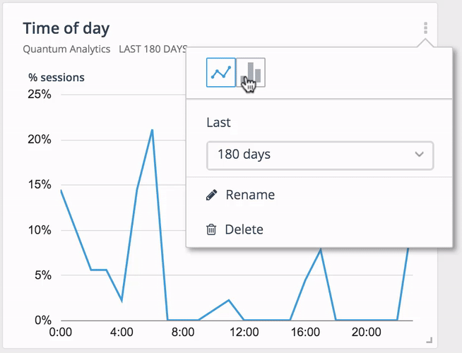
Here, the analytics team is providing a dashboard widget that gives you the ability to change the chart type and duration size. As you saw with rule 2 about adaptive charts, this is pretty easy to get up and running.
5. Get Your Hands Dirty with the Drawing API
The Drawing API was first introduced in the Q2 2014 release of Kendo UI. In the announcement article for this release, Burke Holland described this capability as follows:
After two years of building data visualization widgets as part of Kendo UI, we had to figure out how to draw shapes to SVG, [HTML5] Canvas and even VML for older versions of Internet Explorer. In the process of building this rendering engine, we realized we had essentially developed a drawing API. We decided to make this API official and get it documented so that we could expose it to you. This API will give you direct programmatic access to the same API that the widgets use internally to draw all of the different charts to the various surfaces.
As you saw with rule 3 (custom visuals), you can leverage the drawing API to build some great looking data visualizations. Or, you could forget about using the chart widget and simply draw:
See the Pen Apple Watch Activity App in Kendo UI by John Bristowe (@jbristowe) on CodePen.
This is a live example using the drawing API to re-create the design of the Apple Watch Activity App. (The meat of this demo is located in the JavaScript tab.) The beauty of the drawing API is that you don't have to provide an implementation for HTML5 canvas and SVG; Kendo UI takes care of the rendering for you.
6. Feel Free to Paint Outside the Lines
Kendo UI provides a foundation to create beautiful data visualizations. Don't be afraid to get your hands dirty:
See the Pen HIBP with Kendo UI by John Bristowe (@jbristowe) on CodePen.
This is a live example that displays a bubble chart of Have I Been Pwned?. For this data visualization, I took a different approach to rendering the data by having a chronological scale for the yField axis representing the day of the year. I also used a series of bindings to display the chart data in a group of elements below the chart when you hover over the bubbles with your mouse or finger. The idea here is try and give a different perspective on the data.
Here's another example using the donut chart to display the growing seasons of vegetables in the northern hemisphere:
See the Pen Vegetables in Season with Kendo UI by John Bristowe (@jbristowe) on CodePen.
The point I wish to make is this: Kendo UI provides a powerful foundation to create beautiful data visualizations. As I like to tell my sons from time-to-time, don't be afraid to paint outside the lines.

John Bristowe
John Bristowe is a member of the Developer Relations team at Progress. He specialises in web and mobile app development.
Comments
All articles
Topics
Latest Stories
in Your Inbox
Subscribe to be the first to get our expert-written articles and tutorials for developers!
All fields are required