
Understanding Xamarin.Forms Layouts

The first article in this series on Xamarin.Forms looked at some of the features that the toolkit provides, and how it is more than just UI controls. Of course, Xamarin.Forms does provide a rich set of controls to build user interfaces with from a single codebase.
In this article, we'll take a look at a fundamental building block of arranging those controls on-screen - Layouts.
Types of Layouts
A Xamarin.Forms layout is a subtype of the View class, and its purpose is to organize other Views placed within it (which I'll refer to as controls in this article), in a specified manner.
The manner in which the layout organizes those controls is determined by the layout's type. In this article, we'll explore four common layouts that are used regularly when building user interfaces with Xamarin.Forms.
The layouts we'll look at in order of increasing complexity are: * StackLayout * GridLayout * AbsoluteLayout * RelativeLayout
We'll look at the intended purpose of each layout, useful properties each provides to arrange child controls on-screen, tips to best utilize the layout, and a quick XAML code example of the layout in action.
StackLayout
The StackLayout is the simplest of all the layouts. It arranges child controls on either a vertical or a horizontal axis. Only a single control can occupy any row or column in the one dimensional grid this layout provides.
Properties
The following properties are used by the StackLayout to help it arrange its controls.
* Orientation - indicates which direction the StackLayout should layout the controls. Values can either be Vertical or Horizontal.
* Spacing - a Double to indicate how much space should be in-between each control in the StackLayout.
Tips
- Pay attention to each control's
LayoutOptionswithin theStackLayout, as that will determine the position and size of the control. StackLayoutsare best for simple layouts. Don't try to create complex layouts by nesting severalStackLayoutstogether, one of the other layouts will probably be better suited.- Do not host only a single control in a
StackLayout.
Example
All of the examples that we'll go through today will have BoxViews in the layout. BoxViews are great for this because they can show the entire space allocated to a particular View with a color.
Also all the examples will be in XAML. However, everything you see can be created in C# as well if you prefer.
This first example demonstrates a series of StackLayouts, using both the Orientation and Spacing properties.
<StackLayout Orientation="Vertical" Spacing="20">
    <StackLayout Orientation="Horizontal">
        <BoxView Color="Aqua" HeightRequest="100" WidthRequest="100" />
        <BoxView Color="Lime" WidthRequest="100" />
        <BoxView Color="Purple" WidthRequest="100" />
        <BoxView Color="Blue" WidthRequest="100" />
    </StackLayout>
    <StackLayout Orientation="Horizontal" Spacing="30">
        <BoxView Color="Red" HeightRequest="100" WidthRequest="100"/>
        <StackLayout Orientation="Vertical" Spacing="3">
            <BoxView Color="#FF80FF" HeightRequest="15" WidthRequest="100" />
            <BoxView Color="#FF80FF" HeightRequest="15"  />
            <BoxView Color="#FF80FF" HeightRequest="15"  />
            <BoxView Color="#FF80FF" HeightRequest="15"  />
            <BoxView Color="#FF80FF" HeightRequest="15"  />
        </StackLayout>
        <BoxView Color="#00264d" HeightRequest="100" WidthRequest="100"/>
    </StackLayout>
    <StackLayout Orientation="Horizontal" Spacing="2">
        <BoxView Color="#FF9900" HeightRequest="100" WidthRequest="100" />
        <BoxView Color="#00FD99" HeightRequest="100" WidthRequest="100"/>
        <BoxView Color="Gray" HeightRequest="100" WidthRequest="100"/>
    </StackLayout>
</StackLayout>
That code produces the following screen:
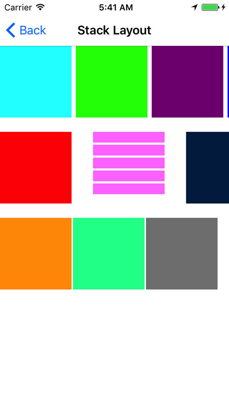
Notice that there is an overall vertical layout with a spacing of 20 between the rows. Inside, there are 3 horizontal layouts, each having various spacing. Finally, the middle, horizontal, StackLayout has a vertical StackLayout nested within it.
Grid
Whereas a StackLayout arranges controls in one dimension, a Grid arranges its controls in a two-dimensional, grid pattern.
A defining characteristic of a Grid is that its rows and columns can have their heights and widths set to varying values. They could contain an absolute value, be proportionally assigned, or be assigned by the controls height or width they contain.
Properties
- ColumnSpacing - a
Doublethat specifies the amount of space between the columns in theGrid. - RowSpacing - a
Doublethat specifies the amount of space between the rows. - ColumnDefinitions - a collection of
ColumnDefinitionobjects - eachColumnDefinitionhas one property,Width. (See section below on how to specify.) - RowDefinitions - a collection of
RowDefinitionobjects - eachRowDefinitionhas one property,Height. (See section below on how to specify.)
Specifying Height and Width
Below is a quick example of defining 3 rows and specifying 3 types of heights on those rows.
<Grid.RowDefinitions>
    <RowDefinition Height="Auto" />
    <RowDefinition Height="*" />
    <RowDefinition Height="100" />
</Grid.RowDefinitions>
There are 3 possible values that can go into the Height or Width properties.
- Auto - the word "Auto" indicating the row or column should size itself to fit its contents.
- * - an asterisk indicating the row or column should take up the remaining space on screen proportionally. Several of these "star" indicators can appear within the same
Gridmeaning that each row or column will be proportionally sized. And a number can precede the star, so1.5*will get 1.5 times the space as*. - Absolute - this is the specific value the height or width for the row or column and is expressed as a number.
Attached Properties
Before proceeding, a word must be said about attached properties. Attached properties are a means by which a property that belongs to one object is assigned a value from the XAML definition of another object. In other words, the properties below are all Grid properties, but their value is being set from within the child controls in the Grid.
In the example:
<BoxView Grid.Row="1" Grid.Column="2" Color="Red" />Grid.Row and Grid.Column are attached properties.
The attached properties for the grid are:
- Column - zero based index of the column the control resides in.
- Row - zero based index of the row the control resides in.
- ColumnSpan - the number of columns the control crosses.
- RowSpan - the number of rows the control crosses.
Tips
- Do not use a grid to layout controls when a
StackLayoutwill suffice. - Use the Star based sizing of rows and columns over
Autowhen possible. Gridsare great for layering controls over the top of one another.
Example
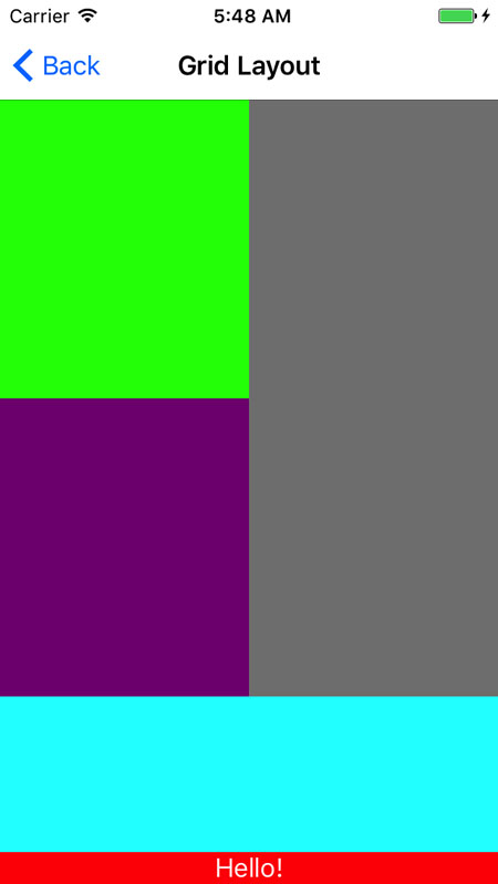
<Grid RowSpacing="0" ColumnSpacing="0">
    <Grid.ColumnDefinitions>
        <ColumnDefinition Width="*" />
        <ColumnDefinition Width="*" />
    </Grid.ColumnDefinitions>
    <Grid.RowDefinitions>
        <RowDefinition Height="*" />
        <RowDefinition Height="*" />
        <RowDefinition Height="100" />
        <RowDefinition Height="Auto" />
    </Grid.RowDefinitions>
    <BoxView Color="Lime" Grid.Column="0" Grid.Row="0" />
    <BoxView Color="Purple" Grid.Column="0" Grid.Row="1" />
    <BoxView Color="Aqua" Grid.Column="0" Grid.Row="2"
        Grid.ColumnSpan="2" />
    <Label Text="Hello!" Grid.Column="0" Grid.Row="3" Grid.ColumnSpan="2"
        HorizontalOptions="FillAndExpand" HorizontalTextAlignment="Center"
        BackgroundColor="Red" TextColor="White" />
    <BoxView Color="Gray" Grid.Column="1" Grid.Row="0" Grid.RowSpan="2" />
</Grid>
The above code defines a Grid with 2 columns and 4 rows. The gray BoxView on the right side spans multiple rows. The red and aqua rows at the bottom span multiple columns. The bottom, red-colored row is sized so its height fits only Label placed within it. The aqua-colored row above that is sized to be exactly 100 units. The other two rows then split the remaining space.
AbsoluteLayout
As its name suggests, an AbsoluteLayout arranges controls on screen exactly as the X, Y, height and width are specified with the top left corner of the layout serving as the X=0 and Y=0 point. In addition to exact specification, with the AbsoluteLayout you can also proportionally specify the control's position, height and width based on the overall layout size. In other words, you can specify that a control should appear 20% across and 50% down.
Attached Properties
Attached properties are again used so the control can specify where it is positioned within an AbsoluteLayout.
- LayoutBounds - a comma delimited string of numbers. The numbers may represent an absolute or proportional value (specified as between 0.0 and 1.0). Each position of the string represents the following:
- X position of the control.
- Y position.
- Width.
- Height.
- LayoutFlags - specifies which, if any, of the bounds of the control should be proportionally allocated. This property can be set to the following values:
- None - all values in
LayoutBoundsare interpreted as absolute. - All - all values are interpreted as proportional.
- XProportional - the X value is interpreted as proportional the rest as absolute.
- YProportional - the Y value is proportional, the rest absolute.
- WidthProportional - width is proportional, rest absolute.
- HeightProportional - height is proportional, rest absolute.
- PositionProportional - X and Y are proportional, height and width absolute.
- SizeProportional - height and width are proportional, X and Y are absolute.
- None - all values in
Tips
- You can mix both static and proportional
LayoutBoundsvalues for a single control. LayoutFlagscan be combined via a comma separated list in XAML.- Be aware it is possible to position controls off the screen when using proportional values with an
AbsoluteLayout, you need to take the size of the control into account. AbsoluteLayoutis a great layout when overlays across the entire screen need to be presented.AbsoluteLayoutalso is worth consideration when animation of controls across the screen is required.- Some thought should be given as to how the screen will look in both portrait and landscape mode when mixing absolute and proportional positioning/sizing.
Example
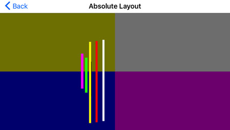
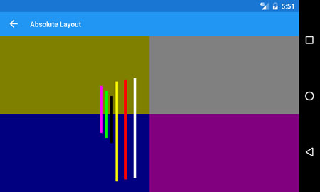
The following example demonstrates an AbsoluteLayout with controls that have LayoutFlags of All, PositionProportional and SizeProportional.
<AbsoluteLayout>
    <BoxView Color="Olive" AbsoluteLayout.LayoutFlags="All"
        AbsoluteLayout.LayoutBounds="0,0,.5,.5" />
    <BoxView Color="Gray" AbsoluteLayout.LayoutFlags="All"
        AbsoluteLayout.LayoutBounds="1,0,.5,.5" />
    <BoxView Color="Navy" AbsoluteLayout.LayoutFlags="All"
        AbsoluteLayout.LayoutBounds="0,1,.5,.5" />
    <BoxView Color="Purple" AbsoluteLayout.LayoutFlags="All"
        AbsoluteLayout.LayoutBounds="1,1,.5,.5" />
    <BoxView Color="Fuchsia" AbsoluteLayout.LayoutFlags="SizeProportional"
        AbsoluteLayout.LayoutBounds="200,100,.01,.3" />
    <BoxView Color="Lime" AbsoluteLayout.LayoutFlags="SizeProportional"
        AbsoluteLayout.LayoutBounds="210,110,.01,.3" />
    <BoxView Color="Black" AbsoluteLayout.LayoutFlags="SizeProportional"
        AbsoluteLayout.LayoutBounds="220,120,.01,.3" />
    <BoxView Color="White" AbsoluteLayout.LayoutFlags="PositionProportional"
        AbsoluteLayout.LayoutBounds=".45,.75,5,200" />
    <BoxView Color="Red" AbsoluteLayout.LayoutFlags="PositionProportional"
        AbsoluteLayout.LayoutBounds=".42,.78,5,200" />
    <BoxView Color="Yellow" AbsoluteLayout.LayoutFlags="PositionProportional"
        AbsoluteLayout.LayoutBounds=".39,.81,5,200" />
</AbsoluteLayout>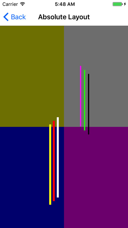
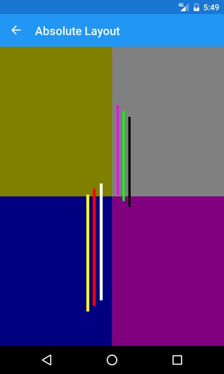
The four large BoxViews that form the background of the screen use proportional sizing and positioning, and are set to take up one quarter of the screen each.
The thin BoxViews in the gray quadrant are all set to be SizeProportional, meaning their X and Y are absolute and will not change, but their height and width are dependent upon the orientation and size of the device.
The thin BoxViews in the blue quadrant are all PositionProportional. Their height and width are absolute, but their X and Y are dependent upon the orientation and size of the device.
The screenshots below demonstrate how the BoxViews change when the device is rotated.
RelativeLayout
The last layout I want to cover is the RelativeLayout. The RelativeLayout positions its child controls relatively to one another and to their parent based on constraints to their position and size properties.
Attached Properties
Attached properties again dictate how the controls are arranged. Each of the following properties constrain their respective position or size value to be dependent upon another View in the layout:
- XConstraint - the X position.
- YConstraint - the Y position.
- WidthConstraint - the width of the control.
- HeightConstraint - the height of the control.
ConstraintExpression
The values of the above properties are set to a ConstraintExpression. The ConstraintExpression is used to relate the size or position of one control to another control within the RelativeLayout.
There are several properties which comprise a ConstraintExpression:
- Type - indicates whether the constraint is relative to the control's parent (
RelativeToParent) or to another control (RelativeToView). - ElementName - if
Typeis set toRelativeToViewthis is the control's name the constraint is relative to. - Property - the property name the constraint is relative to.
- Factor - a multiplier to apply to the
Propertyvalue. - Constant - a constant to add to the
Propertyvalue.
An example of a ConstraintExpression constraining the X position of one control relative to another control (always 20 units to the left of it) looks like the following:
RelativeLayout.XConstraint="{ConstraintExpression Type=RelativeToView, ElementName=aquaBox,
    Property=X, Factor=1, Constant=-20}"
Tips
- Computing the size and positions of all the controls within a
RelativeLayoutcan be slow. Thought should be given whether another Layout can be used in lieu of this. - The height and width of a control can also be specified through the control's
HeightRequestandWidthRequestproperties instead of the constraint properties.
Example
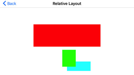
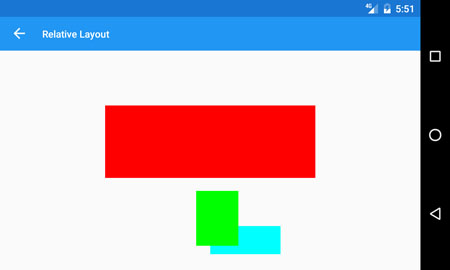
This last example shows a RelativeLayout in something of an abstract art piece. It contains BoxViews that are relative to both other BoxViews and to their parent container.
<RelativeLayout>
    <BoxView Color="Aqua" x:Name="aquaBox"
        RelativeLayout.XConstraint="{ConstraintExpression Type=RelativeToParent,
                                        Property=Width, Factor=0.5}"
        RelativeLayout.YConstraint="{ConstraintExpression Type=RelativeToParent,
                                        Property=Height, Factor=.8}"
        WidthRequest="100" />

    <BoxView Color="Lime" x:Name="limeBox"
        RelativeLayout.XConstraint="{ConstraintExpression Type=RelativeToView, ElementName=aquaBox,
                                        Property=X, Factor=1, Constant=-20}"
        RelativeLayout.YConstraint="{ConstraintExpression Type=RelativeToView, ElementName=aquaBox,
                                        Property=Y, Factor=1, Constant=-50}"
        RelativeLayout.WidthConstraint="{ConstraintExpression Type=RelativeToParent,
                                            Property=Width, Factor=.1}"
        RelativeLayout.HeightConstraint="{ConstraintExpression Type=RelativeToParent,
                                            Property=Height, Factor=.25}"/>

    <BoxView Color="Red" x:Name="redBox"
        RelativeLayout.XConstraint="{ConstraintExpression Type=RelativeToParent, Property=Width, Factor=.25}"
        RelativeLayout.YConstraint="{ConstraintExpression Type=RelativeToParent, Property=Height, Factor=.25}"
        RelativeLayout.WidthConstraint="{ConstraintExpression Type=RelativeToParent, Property=Width, Factor=.5}"
        RelativeLayout.HeightConstraint="{ConstraintExpression Type=RelativeToParent, Property=Height, Factor=.33}"/>
</RelativeLayout>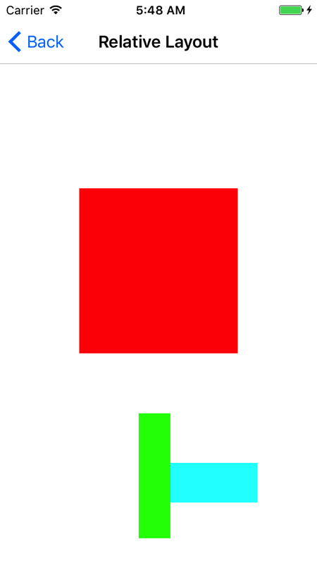
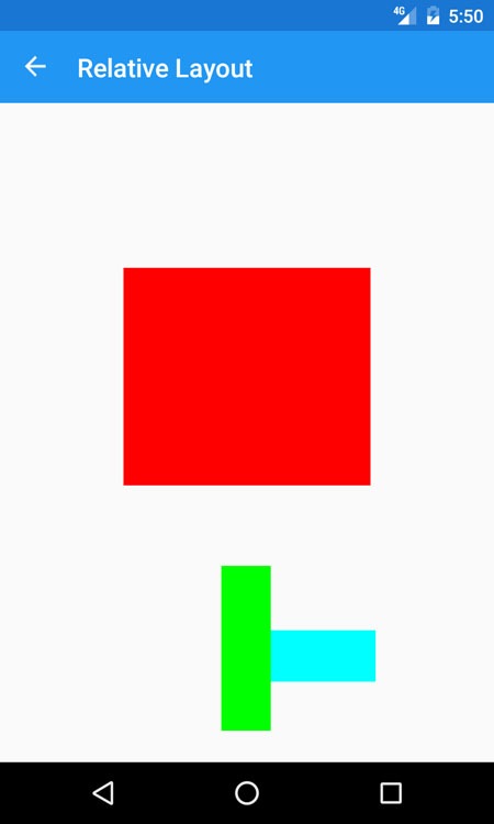
Here the aqua BoxView is specifically requesting its width to be 100, otherwise it is receiving its X and Y position relative to its parent. The lime BoxView is setting its X and Y relative to the aqua BoxView. However it is setting its size relative to its parent. Finally, the red BoxView is setting its size and position all relative to its parent.
When the device is rotated, you can see how the layout changes the position and sizes of the elements. So care must be given when designing with a RelativeLayout to consider both landscape and portrait.
Summary
Xamarin.Forms provides several different layout mechanisms for sizing and positioning controls on-screen from within your app. Each layout allows child Views to be added to it and the layout takes care of calculating how to arrange them. The four main layouts are:
- StackLayout - use when several controls need to be presented along one dimension.
- Grid - provides the ability to arrange controls in a two-dimensional grid, with the ability for controls to span columns and rows.
- AbsoluteLayout - arrange controls exactly on-screen in absolute coordinates and sizes or proportionally to the layout's size and position.
- RelativeLayout - arrange controls relatively to one another and/or to their parent.
Using those four types of layouts, one can build extremely detailed screens, or keep the screens as simple as possible. The power lies in coding the user interface once, then have the layouts arrange the Views on-screen to result in an app that has the same fundamental look on each platform.
Building Xamarin iOS/Android/Forms apps and crave for polished UI controls? Take a look at Telerik UI for Xamarin - well engineered performant and rich UI controls, ready for your app out of the box!
Related resources:
- Jumpstart Your Xamarin App Development (tutorial)
- What is Xamarin.Forms? (article)

The Telerik Team
Related Posts
Comments
All articles
Topics
Latest Stories
in Your Inbox
Subscribe to be the first to get our expert-written articles and tutorials for developers!
All fields are required