
Stay Sharp with Razor TagHelpers

TagHelpers are a new addition to ASP.NET Core that allow developers to write complex HTML elements using a component-like syntax. Let’s begin by discussing the reason TagHelpers were created. By understanding why TagHelpers were created, we can get a better idea of what TagHelpers are and how to identify them.
Why Were TagHelpers Created?
The TagHelper syntax looks like HTML by using elements and attributes but is processed by Razor on the server. TagHelpers are an alternative syntax to HTML Helper methods and improve the developer experience by providing a rich and seamless API that could not be achieved with Razor alone.
These reasons become much more apparent by comparison. By seeing an HTMLHelper used alongside a TagHelper, we can easily identify the benefits they provide.
Let's use a simple button for an example. Here we have an HTML link which uses the bootstrap button style btn btn-primary and an href of /index, the button also includes the text Go Home.
<a href="/index" class="btn btn-primary">Go Home</a>
Using an HTMLHelper
We could create this same markup using the ActionLink HTMLHelper to render the button. However, the developer experience starts to suffer once we begin adding the button style to the element.
<!-- just a link, no style -->
@Html.ActionLink("Go Home", "Index")

<!-- just a link, with style  -->
@Html.ActionLink("Go Home", "Index", "Home", null, new { @class = "btn btn-primary" })

<!-- Rendered HTML -->
<a href="/index" class="btn btn-primary">Go Home</a>
When a CSS class is added to an ActionLink helper, the method signature must be satisfied completely. In addition to the long method signature, the syntax for adding a CSS class requires additional declaration including escape characters. All of this leads to overly complex code intermixed with HTML markup.
The TagHelper Way
In ASP.NET Core, TagHelpers were added to help alleviate the complex syntax that HTMLHelpers can require. TagHelpers continue to use Razor to generate HTML, but they do so in a less obtrusive way. Because TagHelpers rely on elements and attributes instead of requiring an escape character to transition into server side code, they can behave more like HTML.
Let's revisit the previous example and see how a TagHelper compares to the HTML and HTMLHelper syntax. This time we'll start with an anchor tag <a and use the asp-action attribute to initialize the tag helper. When Razor sees the asp-action attribute, it recognizes that the attribute's value is C# code.
When TagHelper code is recognized by the parser, the code changes to bold with a purple highlight. Note: colors may vary due to system preferences.
<!-- HTMLHelper -->
@Html.ActionLink("Go Home", "Index", "Home", null, new { @class = "btn btn-primary" })

<!-- TagHelper -->
<a asp-action="Index" class="btn btn-primary">Go Home</a>

<!-- Rendered HTML -->
<a href="/index" class="btn btn-primary">Go Home</a>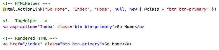
Simplified Forms
Another place where TagHelpers excel is in HTML form creation. Previously MVC relied on complicated HTMLHelpers to accomplish this task. HTMLHelpers are not ideal for scenarios where the helper must contain child elements.
To render content within an HTMLHelper, the helper must encapsulate the content within a using statement. The using statement leads to a poor developer experience by interrupting the normal flow of HTML with pure C# syntax.
In the following example, the same password reset form is shown using both TagHelpers and HTMLHelpers.
<!-- Form using HTMLHelpers -->
@using (Html.BeginForm("ChangePassword", "Manage", FormMethod.Post, new { @class = "form-horizontal", role = "form" }))
{
    <h4>Change Password Form</h4>
    <hr />
        @Html.ValidationSummary(false,"", new { @class = "text-danger" })
    <div class="form-group">
        @Html.LabelFor(m => m.OldPassword, new { @class = "col-md-2 control-label" })
        <div class="col-md-10">
            @Html.TextBoxFor(m => m.OldPassword, new { @class = "form-control" })
            @Html.ValueFor(m => m.OldPassword)
        </div>
    </div>
    <!-- More HTML -->
}
Below, you can see how TagHelpers provide a much clearer picture of what the rendered HTML will be.
<!-- Form using TagHelpers -->
<form asp-controller="Manage" asp-action="ChangePassword" method="post" class="form-horizontal" role="form">
    <h4>Change Password Form</h4>
    <hr />
    <div asp-validation-summary="ValidationSummary.All" class="text-danger"></div>
    <div class="form-group">
        <label asp-for="OldPassword" class="col-md-2 control-label"></label>
        <div class="col-md-10">
            <input asp-for="OldPassword" class="form-control" />
            <span asp-validation-for="OldPassword" class="text-danger"></span>
        </div>
    </div>
    <!-- More HTML -->
</form>
Creating your own
In ASP.NET Core creating your own TagHelpers is a straightforward process and easier than writing HTMLHelpers. Creating a TagHelper starts by inheriting the TagHelper base class and overriding its Process method. Let's take a look at the workflow by creating an alert helper using Bootstrap.
We'll start with the HTML our AlertTagHelper will render. The alert will be a simple div element that that utilizes Bootstrap's alert alert-warning CSS classes. The alert will also feature a "close" button that will dismiss the alert.
<!-- Desired output -->
<div class="alert alert-warning alert-dismissible" role="alert">
        <strong>This is a content area</strong>
    <button class="close" aria-label="Close" type="button" data-dismiss="alert"><span aria-hidden="true">×</span></button>
</div>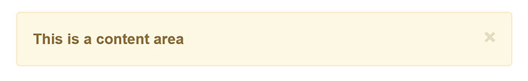
With the HTML defined, the desired TagHelper is outlined. For this example it will be an <alert> tag.
<!-- Desired Tag -->
<alert><strong>This is a content area</strong></alert>
To create the TagHelper, a new class is created that inherits from the TagHelper base class. Following TagHelper conventions the TagHelper will be named AlertTagHelper, where the prefix matches the name of the tag.
public class AlertTagHelper : TagHelperThe Process method of the base class is overridden - this is where the TagHelper's work will take place. The method also gives developers access to the TagHelperContext and TagHelperOutput. These parameters are used to modify the output generated by the TagHelper.
public override void Process(TagHelperContext context, TagHelperOutput output)Inside the Process method, we'll start by changing the alert tag located in the view, to a div element by setting the TagName property on the output.
output.TagName = "div";The CSS class and role attributes are added to the output by adding to the output's attribute collection.
output.Attributes.Add("class", "alert alert-warning alert-dismissible");
output.Attributes.Add("role", "alert");
To complete the TagHelper, the dismiss button is added. This is done by adding the dismiss button's HTML to the element's content.
public override void Process(TagHelperContext context, TagHelperOutput output)
{
output.TagName = "div";
output.Attributes.Add("class", "alert alert-warning alert-dismissible");
output.Attributes.Add("role", "alert");
output.PostContent.SetHtmlContent(RenderCloseButton());
}
private string RenderCloseButton()
{
return "<button type='button' class='close' data-dismiss='alert' aria-label='Close'><span aria-hidden='true'>×</span></button>";
}
To make the new AlertTagHelper class available to all Razor views, the addTagHelper directive is used in the Views/_ViewImports.cshtml file. The addTagHelper directive takes two parameters - the first defines which TagHelpers to make available (the wild card * selects all), the second parameter is the assembly name.
@addTagHelper *, Microsoft.AspNetCore.Mvc.TagHelpers
@addTagHelper *, MyAppNamespace
The AlertTagHelper is ready to add using the syntax outline earlier.
<alert><strong>This is a content area</strong></alert>Next, we'll add attributes that will control the visibility of the close button. Properties of the TagHelper object will be recognized by Razor as attributes. Let's add a Dismissable property to the AlertTagHelper and toggle the rendering of the close button.
public bool Dismissable { get; set; } = true;
public override void Process(TagHelperContext context, TagHelperOutput output)
{
output.TagName = "div";
output.Attributes.Add("class", "alert alert-warning alert-dismissible");
output.Attributes.Add("role", "alert");
if (Dismissable)
output.PostContent.SetHtmlContent(RenderCloseButton());
}
private string RenderCloseButton()
{
return "<button type='button' class='close' data-dismiss='alert' aria-label='Close'><span aria-hidden='true'>×</span></button>";
}Now the close button can be hidden by setting the dismissable attribute to false.
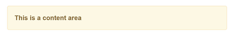
<alert dismissable="false">
    <strong>This is a content area</strong>
</alert>
Custom TagHelpers are a great addition to a project to make complex UI elements easy to write through this simple form of abstraction. In addition to custom TagHelpers like this, third-party TagHelpers can be added providing a robust library of UI elements.
Third-party TagHelpers
Telerik UI for ASP.NET MVC by Progress supports ASP.NET Core TagHelpers for Kendo UI widgets like the NumericTextBox, Button, Window, DatePicker and TimePicker. These TagHelpers support themes, and a robust client and server API.
Adding Telerik UI for ASP.NET MVC
Making UI for ASP.NET MVC available as a service is done through the ConfigureServices() method of the startup class. This method is used to load all of the services you may wish to use through ASP.NET Core via dependency injection (DI):
public void ConfigureServices(IServiceCollection services) {
  services.AddMvc();
  services.AddKendo();
}
The final step is to register the Tag Helpers via _ViewImports.cshtml:
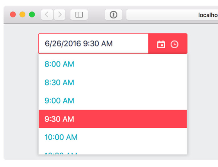
@addTagHelper *, Kendo.MvcWith the TagHelper registered they are available in the project. The example below shows a Date Picker TagHelper.
<kendo-datetimepicker
      name="dateTimePicker"
      value="DateTime.Today"
      min="DateTime.Today"
      on-change="onChange"
/>
Your Choice
TagHelpers are a new addition but not the only choice. TagHelpers aim for a better developer experience by making client and server side HTML creation virtually seamless. Although TagHelpers are great for the examples shown here, HTMLHelpers excel at scenarios where Fluent API chaining can be used to construct complex UIs like: Charts, Grids, and Spreadsheets. Consider using a "right tool for the job" approach when deciding which type of helper is needed for the view being built.
Header image courtesy of Michelle Tribe

Ed Charbeneau
Ed
Related Posts
Comments
All articles
Topics
Latest Stories
in Your Inbox
Subscribe to be the first to get our expert-written articles and tutorials for developers!
All fields are required