
Front-end Application Libraries and Component Architectures

Component architectures are an important part of ever modern front-end framework. In this article, I'm going to dissect Polymer, React, Riot.js, Vue.js, Aurelia and Angular 2 components. The goal is to make the commonalities between each solution obvious. Hopefully, this will convince you that learning one or the other isn't all that complex, given that everyone has somewhat settled on a component architecture.
Understanding Components
The parts of a web user interface form the building blocks for both simple websites and modern front-end applications. These parts are commonly referred to as UI components or UI widgets. The browser offers many native components and, when these are not enough, custom components like Kendo UI can be used.
Generically speaking, in the context of the web, a UI component is a region in a web page that contains an isolated UI feature (i.e. a view) that is distinct from everything around it. For example, an HTML <select> element is considered a native HTML UI component.
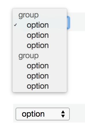
We all know the value of a native <select> component. That is, with little fuss, an HTML <select> element can be placed into a web page and a developer gets:
- An isolated, reusable, and decoupled instance of a
<select>with no side effects; - A default styled UI element that a user can interact with, allowing them to store the state of a decision;
- Configuration that affects the state via properties that are passed declaratively to the component by way of HTML attributes, text, and child components (i.e.
<option>) that can contain attributes and text as well; - An API to imperatively program the component, affecting state, via the DOM and JavaScript (i.e. DOM events and methods).
I'm pointing all of this out because it is this simple concept from the early days of HTML (really since the first GUIs) that tools like Polymer, React, Riot.js, Vue.js, Aurelia, and Angular 2 are all striving to replicate today. All of these tools aim to provide an opinionated solution for creating a custom component with features similar to those we discussed for the HTML <select> component.
I realize that each of these tools also offer varying degrees of other parts that are needed to build front-end applications (router, data-binding, models, dependency management, debug tools etc.). But, as a community, we have congregated around solving the manner in which a complex front-end application is built using a tree of data-bound, single-purpose, self-contained UI components.
I'm not the only one who thinks this. Developers like Brian Ford seem to agree:
"The main primitive (speaking about React, Angular & Ember) is this idea of a 'component'. I think everyone has some notion of what a component is. The idea is that it should be an atomic UI piece that is composable and reusable, and should work with other pieces in a way that's performant."
As well as designers like, Stephen Hay:
"We’re not designing pages, we’re designing systems of components."
What Makes a Component?
Now it might be obvious, but a component is made up of some parts HTML, some parts CSS, and some parts JavaScript. In the past, these parts were divided into separate modules, separating concerns. As of late, this practice is being challenged by things like React where all the parts are defined in one module and potentially all written in JavaScript.
For example, the React HelloMessage component below contains all the HTML, CSS, and JS in one file written in JavaScript alone.
var HelloMessage = React.createClass({
  //JS
  handleClick: function () {
    console.log('You click me!')
  },
  render: function () {
    //CSS
    var divStyle = {
      color: 'white',
      backgroundColor: 'red',
    };
    //HTML/JSX
    return (
      <div style={divStyle} onClick={this.handleClick}>
        Hello {this.props.name}
      </div>
    );
  }
});

ReactDOM.render(<HelloMessage name = "John" />,document.body);Of course, how each tool approaches the construction, loading, relationships, and lifecycle of a UI component is different.
In the upcoming sections, we'll look at how a component is implemented for Polymer, React, Rio.js, Vue.js, Aurelia and Angular 2. For each tool I will examine its default offerings and recommendations in the following categories, as it pertains to a component:
- Module Format: e.g. commonJS
- Dependency management / loading: e.g. Browserify
- Component HTML: e.g. JavaScript defined HTML or JSX
- Component CSS: e.g. plain CSS
- Component JavaScript: e.g. ES5 & Babel
- Binding Style: e.g. two way binding using observable pattern
- Routing: e.g. provided
- Browser support: e.g. evergreen
- Runs Server Side as well as Client-side: e.g. yes
Polymer
The concept of a custom component as the main building block for web applications was blazed by the W3C Web Component specifications and is the foundation for the Polymer project (mostly via a polyfill).
Polymer builds upon the means used by the browser to create something like a <select> (aka "extending the vocabulary of HTML"). In other words, Polymer, helps you build components by providing a way to create your own custom elements with their own API of attributes, properties, methods, and events. Much of this is done by bringing modern application design concepts to HTML.
A Polymer component is defined in an .html module and looks something like this:
//This is my-list.html which defines the <my-list> element

//include polymer
<link rel="import" href="../../bower_components/polymer/polymer.html">

//create component
<dom-module id="my-list">
  //define HTML & CSS
  <template>
    <style>
      :host {
        display: block;
      }
    </style>
    <ul>
      <template is="dom-repeat" items="{{items}}">
        <li><span class="paper-font-body1">{{item}}</span></li>
      </template>
    </ul>
  </template>
  // define JavaScript
  <script>
    (function() {
      'use strict';

      Polymer({
        is: 'my-list',
        properties: {
          items: {
            type: Array,
            notify: true,
          }
        },
        ready: function() {
          this.items = [
            'Responsive Web App boilerplate',
            'Iron Elements and Paper Elements'
          ];
        }
      });
    })();
  </script>
</dom-module>my-list.html into the page then using the <my-list> element in the page.
<!DOCTYPE html>
<html>
  <head>
    <script src="webcomponents-lite.min.js"></script>
    <link rel="import" href="my-list.html">
  </head>
  <body>
    <my-list></my-list>
  </body>
</html>
- Module Format: HTML files containing inline HTML, CSS, or JS or linking too another file containing HTML, CSS, or JS.
- Dependency management / Loading: HTML imports using
<link>element. Polymer does not really deal with dependency management beyond the traditional human ordering. It does provide a solution called vulcanize for combining imports into fewer files. - Component HTML: Plain HTML
- Component CSS: Plain CSS
- Component JavaScript: ES5
- Binding: One-way and two-way binding using
Object.observeand dirty checking - Routing: Recommends third-party solution (i.e. Page.js)
- Browser support: IE10+ and evergreen browsers via polyfills from webcomponents.js.
- Runs Server Side as well as Client-side: No
React
React is known for abstracting DOM updates by using a "virtual DOM" and using a performant DOM diffing solution. However, the success of React is more likely due to the idea of separating the UI into single purpose declarative components that can contain child components. Add in properties and state and React provides a very powerful component model.
At the end of the day React produces HTML. However it will do so while providing a maintainable pattern of dividing the UI into components containing HTML, CSS, and JavaScript.
A React component is defined in a .js or .jsx module and looks something like this (uses Webpack, ES6 modules, JSX, and Babel):
//Timer.js

import React, { Component, PropTypes } from 'react';

class Timer extends Component {
    getInitialState() {
        return {
            secondsElapsed: Number(this.props.startTime) || 0
        };
    }
    tick() {
        this.setState({
            secondsElapsed: this.state.secondsElapsed + 1
        });
    }
    componentDidMount() {
        this.interval = setInterval(this.tick, 1000);
    }
    componentWillUnmount() {
        clearInterval(this.interval);
    }
    render() {
        //component styles
        var divStyle = {
          color: 'white',
          backgroundColor: 'red',
        };
        //component HTML/JSX
        return (
          <div style={divStyle} startTime="10">
              Seconds Elapsed: {this.state.secondsElapsed}
          </div>
        );
    }
};

export default Timer;import ReactDOM from 'react-dom';
import Timer from 'timer.js';
//place the Timer component in the page.
ReactDOM.render( <Timer startTime = "10"/>, document.body);- Module Format: Script Includes, but React recommends using CommonJS or JS 2015 Modules
- Dependency management / Loading: Script Include Order, but React recommends using Browserify or Webpack
- Component HTML: JavaScript defined HTML or Transpiled JSX
- Component CSS: React recommends writing CSS in JavaScript and using inline CSS
- Component JavaScript: ES5 but React recommends JS 2015 via Babel
- Binding: Defaults to one-way data binding but offers two-way.
- Routing: provided by community i.e react-router
- Browser support: ES5 environments or browsers that can be shimmed for ES5 (i.e. IE8+)
- Runs Server Side as well as Client-side: Yes
Make sure to learn more about the core concepts in React from this inclusive collection of resources.
Riot.js
Riot combines patterns from Polymer and React, attempting to provide a more enjoyable syntax and shorter learning curve for creating components.
Additionally, Riot's file size is tiny (18kb) compared to Polymer (101kb) and React (145kb). It's also worth noting that unlike Polymer and React, Riot provides a router as well as an event system, so components can communicate in a loosely coupled way with each other.
I like to think of Riot as a modern Backbone.js implementation. In other words, Riot provides a modern and sufficient spin on JavaScript applications using components, an event system, and a router minus jQuery.
A Riot component is defined in a .tag or .js module and looks something like this:
<my-timer>

  <p>Seconds Elapsed: <span>{ time }</span></p>

  <style scoped>
    span {
      color: red;
    }
  </style>

  <script>
    this.time = opts.start || 0

    tick() {
      this.update({ time: ++this.time })
    }

    var timer = setInterval(this.tick, 1000)

    this.on('unmount', function() {
      clearInterval(timer)
    })
  </script>

</my-timer><my-timer></my-timer>) in an HTML file in the following way.
<!doctype html>
<html>
  <head>
    <title>Riot Example: Timer</title>
    <meta http-equiv="X-UA-Compatible" content="IE=edge">
  </head>

  <body>
    <my-timer start="10"></my-timer>

    <!-- include my-timer component -->
    <script src="my-timer.tag" type="riot/tag"></script>

    <script src="riot+compiler.min.js"></script>

    <!-- mount my-timer component -->
    <script> riot.mount('my-timer') </script>
  </body>
</html>- Module Format: Script includes
- Dependency management / Loading: Script include order
- Component HTML: compiled HTML from JS
- Component CSS: compiled CSS from JS
- Component JavaScript: ES5
- Binding: one-way data binding
- Routing: provided
- Browser support: ES5-compliant browsers
- Runs Server Side as well as Client-side: Yes
Vue.js
Vue.js, much like React, is mostly focused on outputting stateful HTML (i.e. the view layer), using a reactive data binding system. However, unlike React, Vue.js does not make use of a "virtual DOM." Instead, Vue.js uses the actual DOM as the template and still remains just as performant. Yeah, you can do that! And, unless you are dealing with Facebook-like problems alone, having an actual DOM instead of an abstracted DOM might just be better (e.g. animations, real CSS etc..).
The best part of Vue.js is that it can be used as a very simple binding library on any web page. No polyfilling. No transpiling. No HTML abstractions. No virtual DOM. No loaders. Just include one script and you get a powerful view layer for building components.
For example, using Vue.js, it's trivial to construct the canonical, "bind text to an HTML text input element" (i.e. you change text input, some text in the page changes).
<!DOCTYPE html>
<html>
<head>
    <meta charset="utf-8">
    <title>JS Bin</title>
    <script src="http://vuejs.org/js/vue.js"></script>
</head>

<body>
    <div id="app">
        <p>{{ message }}</p>
        <input v-model="message"> <!-- a directive -->
    </div>
    <script>
    new Vue({
        el: '#app',
        data: {
            message: 'Hello Vue.js!'
        }
    })
    </script>
</body>
</html>However, if you want to build a large front-end application from a tree of components, Vue.js doesn't leave you hanging. It provides an evolved component pattern that is simple to grok. As well as an official router and Webpack loader, which gives a developer the baseline tools for building ambitious front-end applications.
A Vue.js component can be defined in an .vue or .js module and looks something like this (using Webpack, vue-loader, and JS 2015):
<!-- my-component.vue -->

<!-- css -->
<style>
.message {
  color: red;
}
</style>

<!-- template -->
<template>
  <div class="message">{{ message }}</div>
</template>

<!-- js -->
<script>
export default {
  props: ['message'],
  created() {
    console.log('my-component created!')
  }
}
</script>my-component.vue module in another module that produces the <my-component></my-component> element.
import Vue from 'vue'
import MyComponent from 'my-component.vue'

new Vue({
  el: 'body',
  components: {'my-component':MyComponent}
})- Module Format: Script include, but Vue recommends using CommonJS or JS 2015 modules
- Dependency management / Loading: Script include order, but Vue recommends using Browserify or Webpack
- Component HTML: plain HTML, but Vue recommends Webpack+vue-loader providing pre-processors
- Component CSS: plain CSS, but Vue recommends Webpack+vue-loader providing pre and post processors
- Component JavaScript: ES5, but Vue recommends Babel
- Binding: one-way (default) and two-way reactive data-binding system
- Routing: provided
- Browser support: IE9+
- Runs Server Side as well as Client-side: Not yet
Aurelia
Aurelia is a JavaScript framework, made up of a handful of npm packages, for creating a front-end application. It reaches into the future and brings you the best of JavaScript 2016 today. I don't feel that Aurelia is overly opinionated or not opinionated enough - I find it to be just right. To me, it seems to provide everything an experienced developer would need to build a front-end application. Today, this, of course, includes a component convention.
An Aurelia component is made up of a JavaScript module (i.e. a view model) and an HTML module which contains the view. These two modules will share the same name, but different extensions (e.g. hello.js and hello.html)
A basic Aurelia component looks something like this (using: JS 2015 modules):
//welcome.js

export class Welcome {
  heading = 'Welcome to Aurelia!';
  firstName = 'John';
  lastName = 'Doe';

  get fullName() {
    return `${this.firstName} ${this.lastName}`;
  }

  submit() {
    alert(`Welcome, ${this.fullName}!`);
  }
}require for the CSS file):
<!-- welcome.html -->
<template>
  <require from="bootstrap.css"></require>
  <section>
    <h2>${heading}</h2>

    <form submit.trigger="submit()">
      <div>
        <label>First Name</label>
        <input type="text" value.bind="firstName">
      </div>
      <div>
        <label>Last Name</label>
        <input type="text" value.bind="lastName">
      </div>
      <div>
        <label>Full Name</label>
        <p>${fullName}</p>
      </div>
      <button type="submit">Submit</button>
    </form>
  </section>
</template>welcome.js component can be used in an HTML file like so:
<html>
  <head>
    <title>Aurelia</title>
    <link rel="stylesheet" href="styles/styles.css">
    <meta name="viewport" content="width=device-width, initial-scale=1">
  </head>
  <body aurelia-welcome> <!-- load welcome.js component -->
    <script src="jspm_packages/system.js"></script>
    <script src="config.js"></script>
    <script>
      System.import('aurelia-bootstrapper');
    </script>
  </body>
</html>- Module Format: JS 2015 Modules
- Dependency management / Loading: system.js and dependency injection
- Component HTML: plain HTML, wrapped in a
<template>element - Component CSS: plain CSS
- Component JavaScript: ES 2015 & 2016 for development and ES5 for production
- Binding: defaults to one-way but offers two-way and one-time. Aurelia uses
Object.observe, getters and setters, dirty-checking or ability to add a custom mechanism - Routing: provided
- Browser support: IE11+ or IE9+ with additional polyfills
- Runs Server Side as well as Client-side: No
Angular 2
Angular 2 is Angular's way of catching up to the concept that your application should be structured as a tree of UI components. Angular 2 is a complete rewrite of the framework offering a modern tool for building front-end applications. Angular 2 is written in TypeScript and favors (almost forces) the fact that Angular 2 applications should be written in TypeScript.
An Angular 2 component is minimally made up of a .js or .ts module that is connected to an HTML element (i.e. selector) along with optional HTML and CSS (that can be written inline or as a separate module).
A basic Angular 2 component looks something like this (using JS 2015 modules, TypeScript, and system.js):
\\ my.hello.ts

import {Component} from 'angular2/core';

@Component({
  selector: 'my-hello',
  template: ` //optionally use templateUrl to load my.hello.html
    <label>Name:</label>
    <input type="text" [(ngModel)]="yourName" placeholder="Enter a name here">
    <hr>
    <h1 [hidden]="!yourName">Hello {{yourName}}!</h1>
  `,
  styles:[` //optionally use styleUrls to load my.hello.css
    label{color:red;}
  `]
})
export class MyHello {
    yourName: string = 'John Doe';
}my.hello.ts module in another module (i.e. app.ts) that will bootstrap the Angular app:
\\ app.ts

import {bootstrap} from 'angular2/platform/browser'
import {MyHello} from './my.hello'

bootstrap(MyHello);app.ts module into an HTML page to create the <my-hello> component:
<!DOCTYPE html>
<html>
  <head>
    <title>Angular 2 </title>
    <script src="system.js"></script>
    <script src="typescript.js"></script>
    <script src="angular2.dev.js"></script>
    <!-- Configure SystemJS -->
    <script>
      System.config({
        transpiler: 'typescript',
        typescriptOptions: { emitDecoratorMetadata: true }
      });
      System.import('app');
    </script>
  </head>
  <!-- Display the application -->
  <body>
    <app>
        <my-hello>Loading...</my-hello>
    </app>
  </body>
</html>- Module Format: Script include, but JS 2015 modules via TypeScript is favored.
- Dependency management / Loading: Script include (via global Angular namespace e.g.
ng) possible but favors system.js and TypeScript with dependency injection - Component HTML: plain HTML
- Component CSS: plain CSS
- Component JavaScript: ES5 possible, but favors JavaScript 2015 & 2016 via TypeScript for development and ES5 for production
- Binding: One-way using a reactive system but two-way is still possible.
- Routing: provided
- Browser support: IE9+
- Runs Server Side as well as Client-side: Yes
Components all the way down
I hope these brief overviews have demonstrated the fact that the component is currently in the spotlight for front-end development. When approaching any of the tools mentioned in this article, or likely any modern solution, just keep in mind that, at the end of the day, each solution is simply trying to provide the means to build something like a custom <select>, but with more sophistication than we once did with jQuery and the DOM alone (i.e. jQuery plugins).
Related resources:
- Angular, AngularJS, and VueJS in 2017: The Important Bits (article)
- JavaScript Libraries and Frameworks and Futures, Oh Yes! (article)
- Choosing the Right JavaScript Framework for Your Next Web Application (whitepaper)
Header image thanks to Raúl Hernández González

Cody Lindley
Cody Lindley is a front-end developer working as a developer advocate for Telerik focused on the Kendo UI tools. He lives in Boise, ID with his wife and three children. You can read more about Cody on his site or follow him on Twitter at @codylindley.
Comments
All articles
Topics
Latest Stories
in Your Inbox
Subscribe to be the first to get our expert-written articles and tutorials for developers!
All fields are required